Project — Branding, 2025
The Maybe
The Maybe works to dismantle dominant narratives and elevate new voices to expand what’s possible.
Client
Critical Consultancy
MY ROLE
AD & Brand Design

The Maybe
Shape New Narratives
Shape New Narratives
The Maybe empowers people to turn knowledge into meaningful action for change.


The Challenge
The Maybe facilitates critical conversations and catalyzes action so that organizations are better prepared, change agents are better platformed, and people are better informed. Not only does their business make impact, their personalities do too. Wanting to personify their dynamic CEO Alix Dunn, we were challenged with designing a brand that boosted engagement and showcased their vibrancy while recognizing the seriousness of their efforts and the topics they discuss.
The Solution
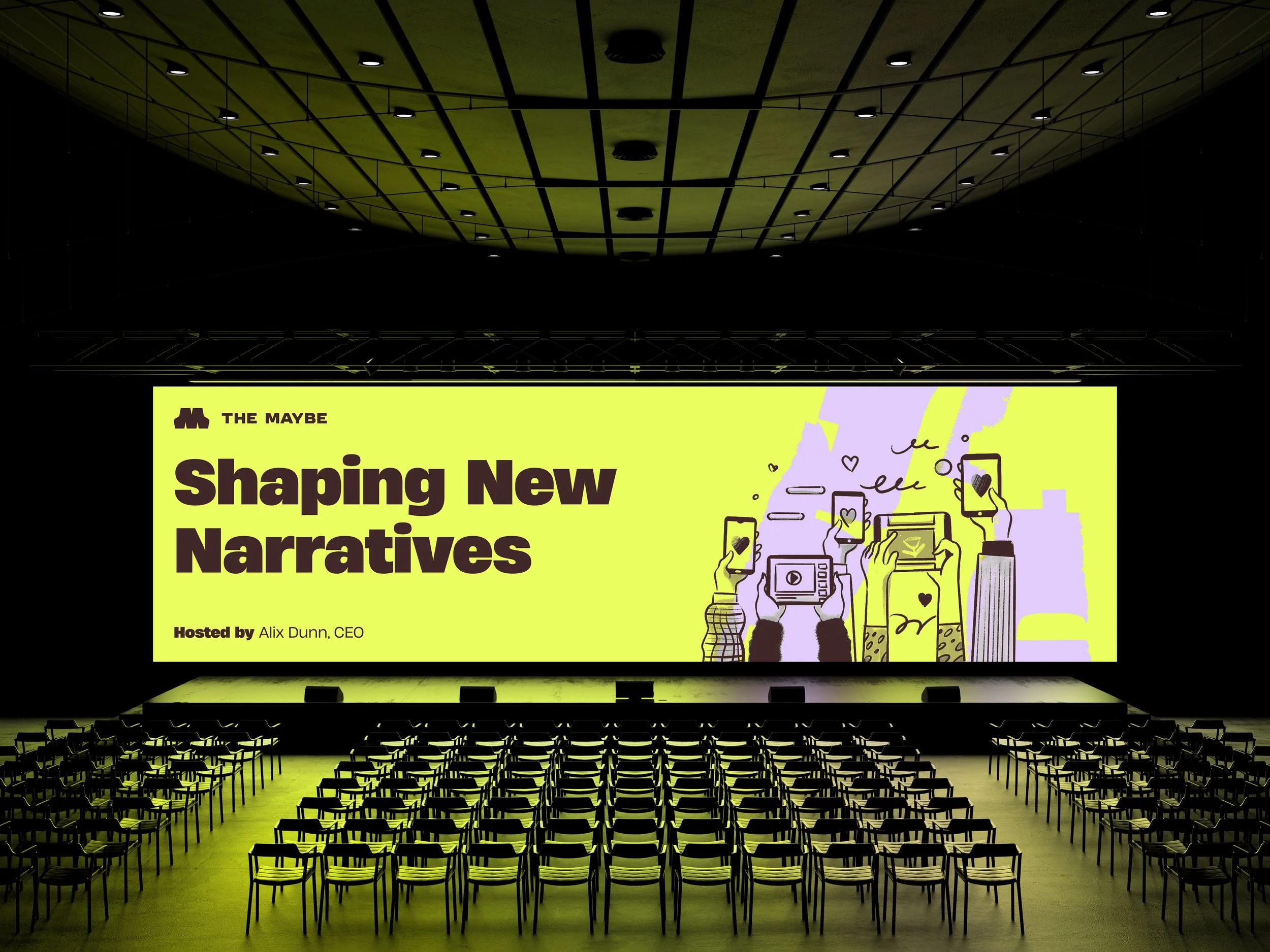
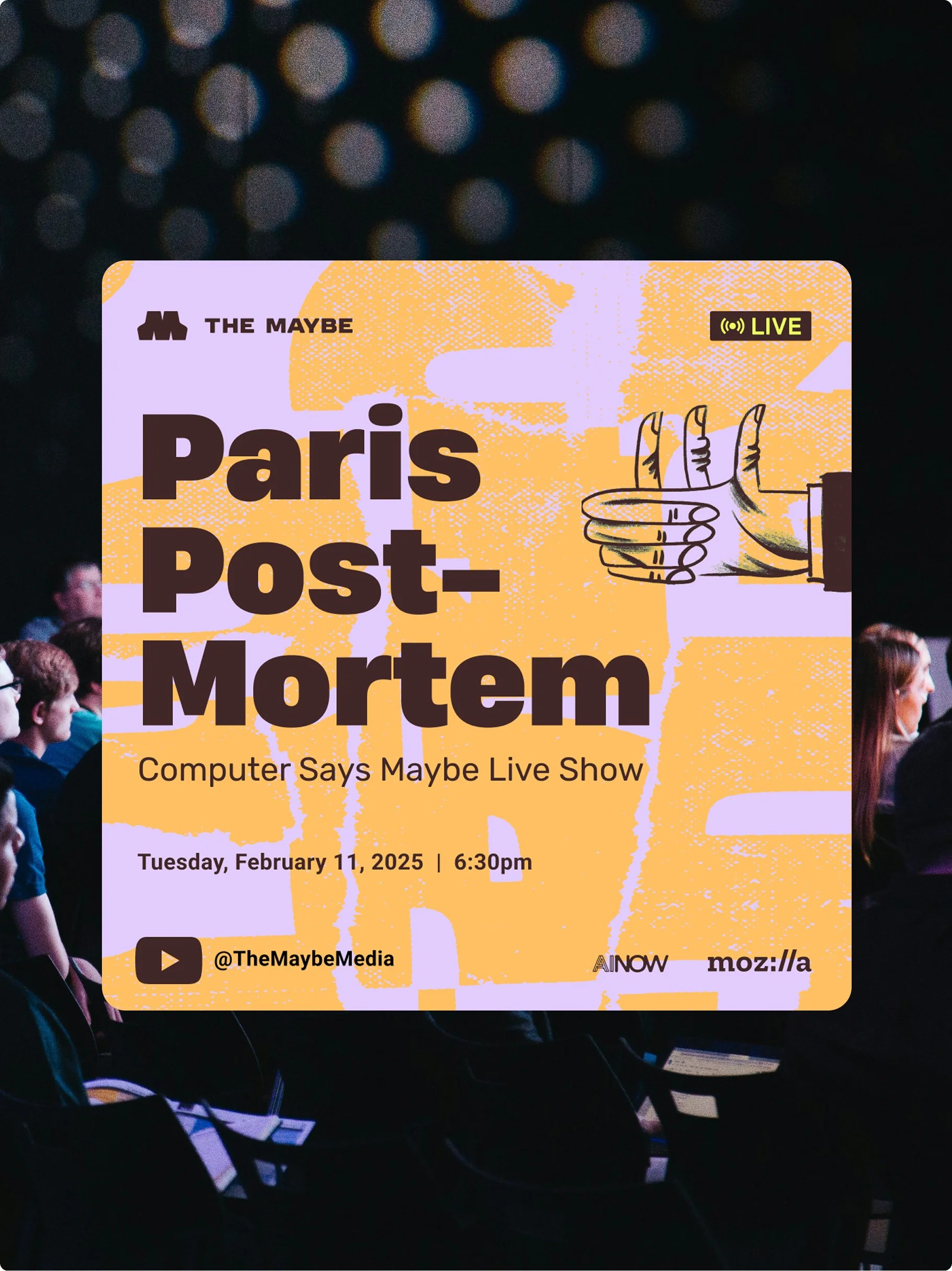
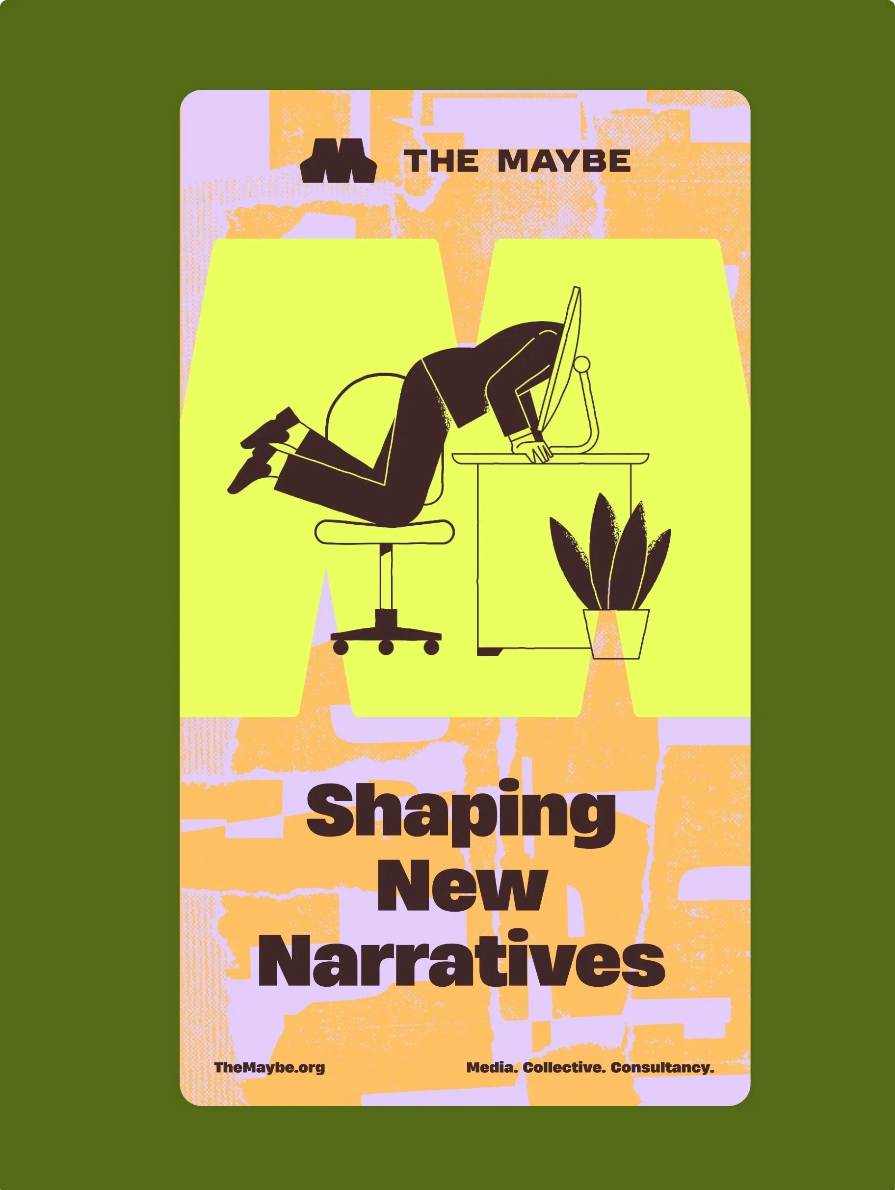
Our solution highlights what’s important by celebrating new voices, new people, and new ideas in a way that feels both approachable and forward-thinking. We allowed them to lead the conversation through bold, confident visuals that command attention and amplify their message. We created a visual language that is exciting and thought-provoking, breaks down intimidation, and makes space for innovation while maintaining a sense of accessibility the “everyman” could engage with.
Unpack the design decisions that bring this vision to life in the sections that follow…
Results
The Maybe re-launched with talks at various tech events in the spring of 2025.
MY ROLE
Art Director at C42D
Art Direction
Brand Design
Engaged with the whole project cycle, I worked closely with the strategy team during the strategy phase before fully taking over brand design and brand guidelines. I then oversaw applications of the brand as well as website design. As the voice of the brand, I presented all concepts and led internal critiques to refine and elevate the project.
THE TEAM
Brand Strategy Clinton Barnes, The Connected Agency
Digital Design TJ Knight, C42D

Moodboard

Shaping New Narratives
This brand is all about layers: peeling back the onion to reveal deeper truths and new perspectives. It encourages asking questions and inviting exploration and discovery. We invite people to look beyond the surface, with elements that feel dynamic and in motion. It’s an approach that embraces the process of uncovering, with raw, unfinished touches that reflect an ongoing quest for knowledge and understanding, like when we write in the margins of a book. The result is a visual language that is both open-ended and thought-provoking, sparking engagement and exploration.

Concept 03
Working Toward Progress
Resembling torn paper, Concept 03 symbolizes the deconstruction of outdated ideas to create space for fresh perspectives. The title's play on "Work in Progress" reflects The Maybe’s commitment to evolving conversations and driving meaningful change in a complex, ever-shifting landscape of technology politics.

Concept 01
Making Your Mark on the World
Concept 01 showcases a wide, bold "M" that embodies The Maybe's mission to empower individuals and organizations to redefine boundaries, take action, and make lasting impact. There is beauty in the contraction of “maybe” presented as strength and definitiveness because, actually, The Maybe is a brand that believes that curiosity and questioning represent just that.

Concept 02
Curiosity Through a New Lens
Two question marks connect to form the shape of an eye, symbolizing a fresh, inquisitive perspective. The mark captures The Maybe’s mission to challenge conventional narratives and encourage critical exploration of complex issues. The eye motif reflects the organization’s dedication to uncovering deeper truths and fostering transformative dialogue.


COLOR PALETTE
Highlighting what’s important.
Highlighter Yellow is The Maybe’s brand color, infusing positivity and creativity, reflecting a forward-thinking approach to AI. They highlight new voices, new people, and new topics that many people don’t regularly hear about.
Since The Maybe focuses on important topics that impact the world today, chocolate brown serves as a warm alternative to black, grounding the palette with a sense of stability to offset the playfulness of the yellow. Paired with a vibrant secondary palette, this combination celebrates those new voices, people, and ideas by embracing their freshness and breaking down the intimidation often associated with the unfamiliar.


