You've lived it. Now teach it.
You've lived it. Now teach it.
In-house Role at

Teachable is a SaaS learning platform that enables creators and businesses to monetize their expertise through courses, coaching, and digital downloads.
MY ROLE
Senior Lead, Design
Sunfish brings expert guidance—financial, administrative, and emotional—to the IVF journey.


I joined the Brand and Content team at Teachable, a SaaS platform for creators, on the heels of a rebrand in need of refinement and guardrails.
As Senior Lead of Design, I partnered across the Marketing, Product, Product Marketing, Web, Partnerships, Content, Copywriting, and Growth teams to expand the visual brand by establishing a phased brand-evolution strategy I presented to executive leadership within 60 days.
I scaled the design team by hiring and onboarding a new designer, implemented a project management system, and enforced brand consistency across B2C and Enterprise initiatives while overseeing the work of the designers who reported to me as well as non-designers tackling their own creative deliverables.
I ramped up quickly and was recently recognized by the Head of Marketing for the impact I made in a short period of time.
MY ROLE
Senior Lead, Design
Owned
Brand Identity Refinements
Visual Strategy
Select Hands-on Design
Activations Overseen
Paid Media
In-person Events and Webinars
Marketing Website and Landing Pages
Product Marketing
Email
Social Media
Commercial Productions (Ads)
MY TEAM
Brand and Content (Marketing)
Manager:
Vera Hanson, Associate Director of Brand and Content
Direct Reports:
Designer, Marina Souto
Designer, Leo Carvallo
Team Members:
Copywriting Kevin Karn, Senior Copywriter
Content Trevor Locke, Brand and Content Lead
Content Chris Chan, Staff Writer and Producer
Social Alec Sutherland, Social Content Marketing Manager
Motion Lucas Souza, Motion Designer
Brand Refinements

VISUAL STRATEGY
Our original color palette played a central role and our first jumping off point: deep and mid-tone olives convey resilience and growth, while citrus tones and periwinkle blues introduce soft brightness and positivity. Golden accents evoke possibility while beige neutrals bring a sense of clarity and transparency. Brick red symbolizes the persistence, strength, and tenacity individuals and couples going through IVF must endure.
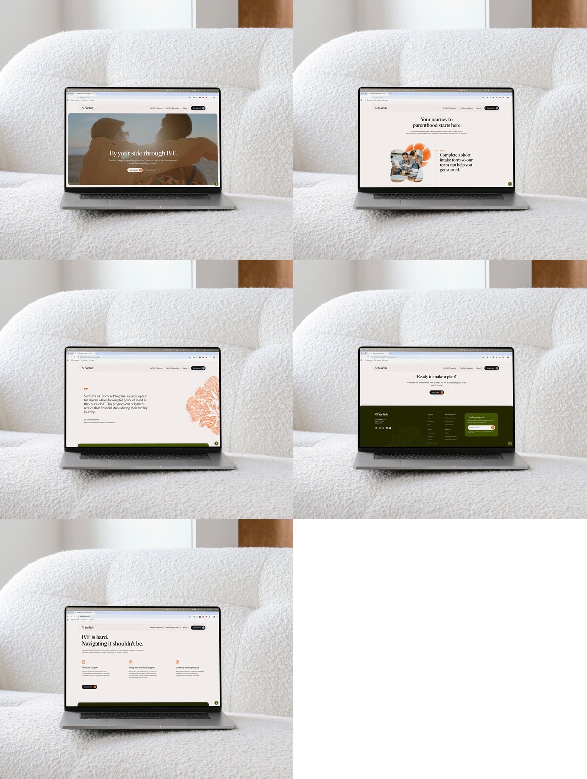
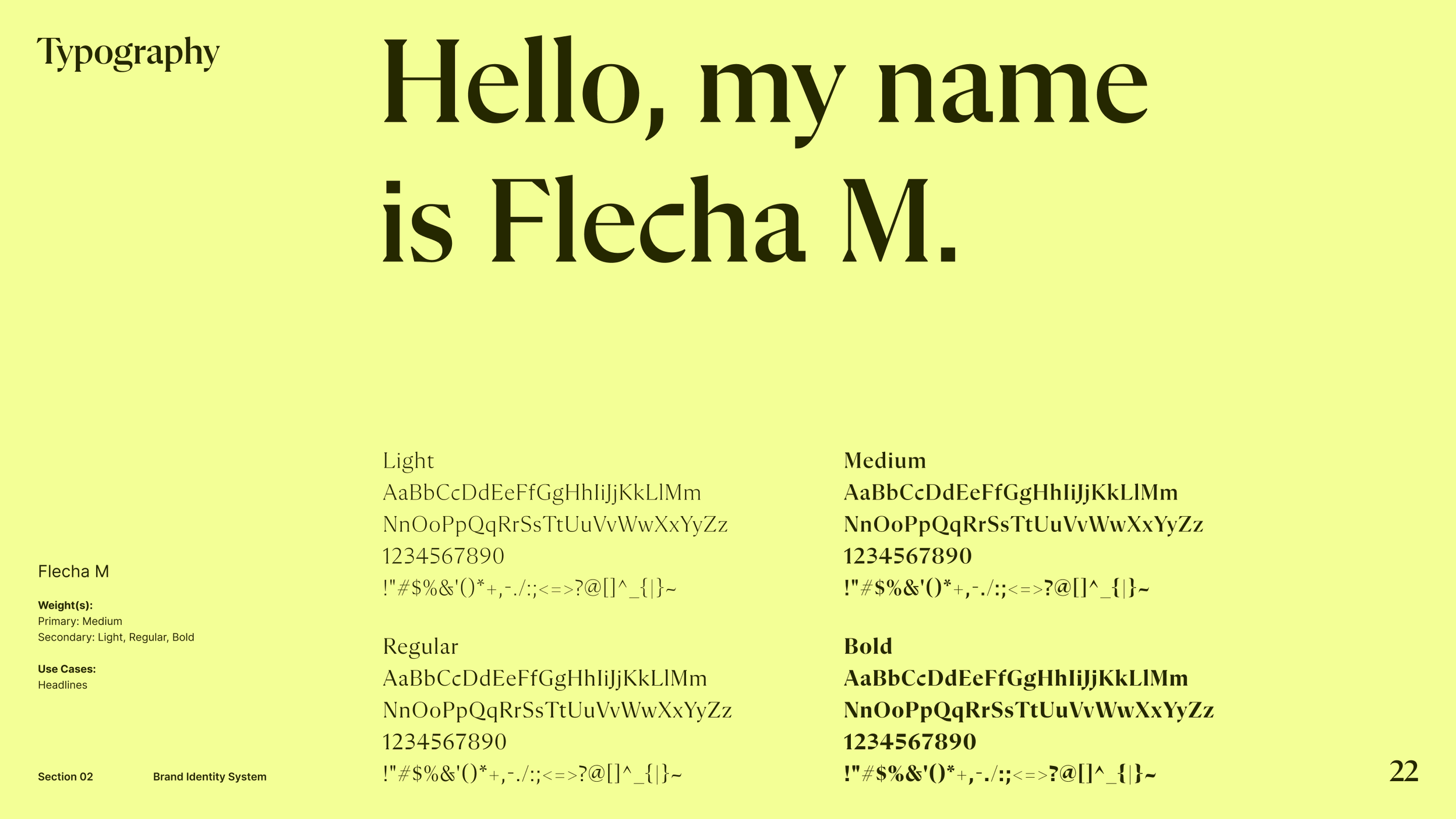
We recommended modern serifs for headings to add a human touch while suggesting body copy be set in easy-to-read sans-serifs, ensuring clarity and approachability.
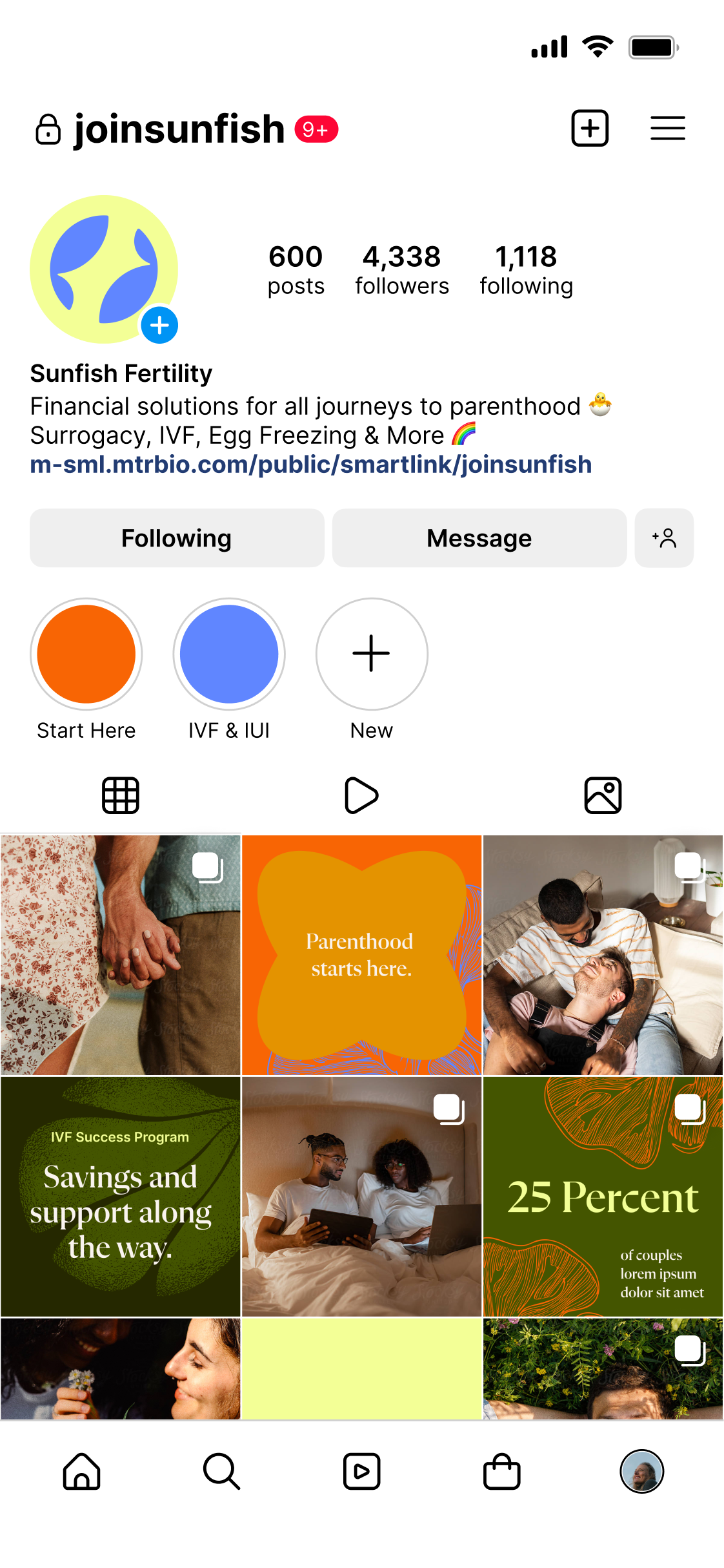
For graphic elements, we were inspired by flowing water and coral forms to symbolize renewal, as well as nod to the company name. These soft, fluid curves evoke a supportive environment and represent the emotional support Sunfish provides.
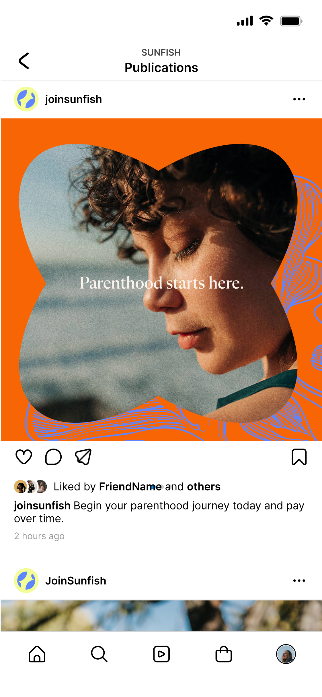
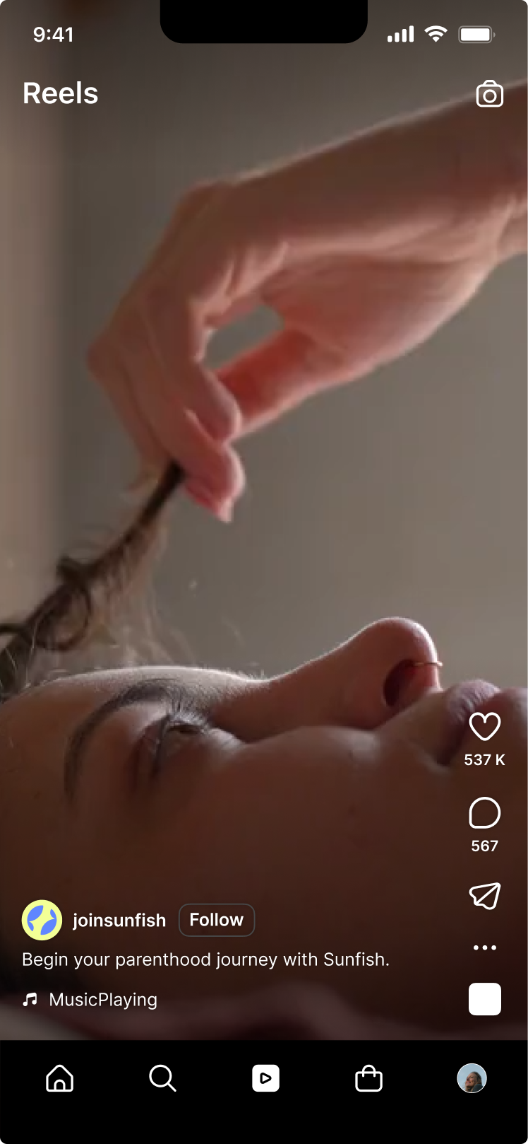
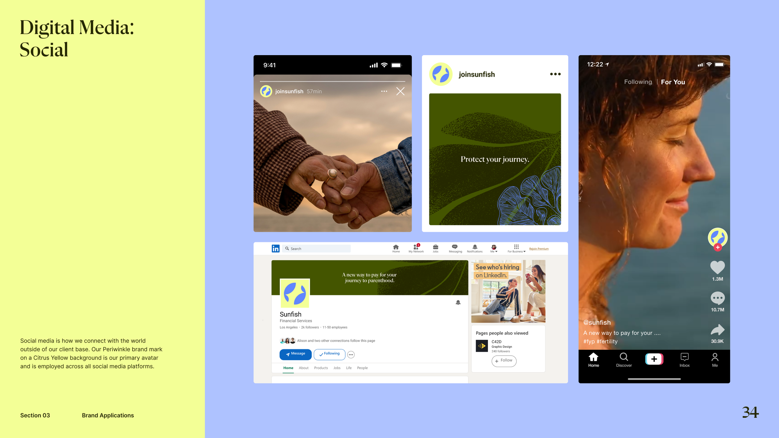
Combined with sunlit imagery and approachable typography, the design reinforces Sunfish’s role as a reliable, empathetic partner.





FINAL COLOR PALETTE
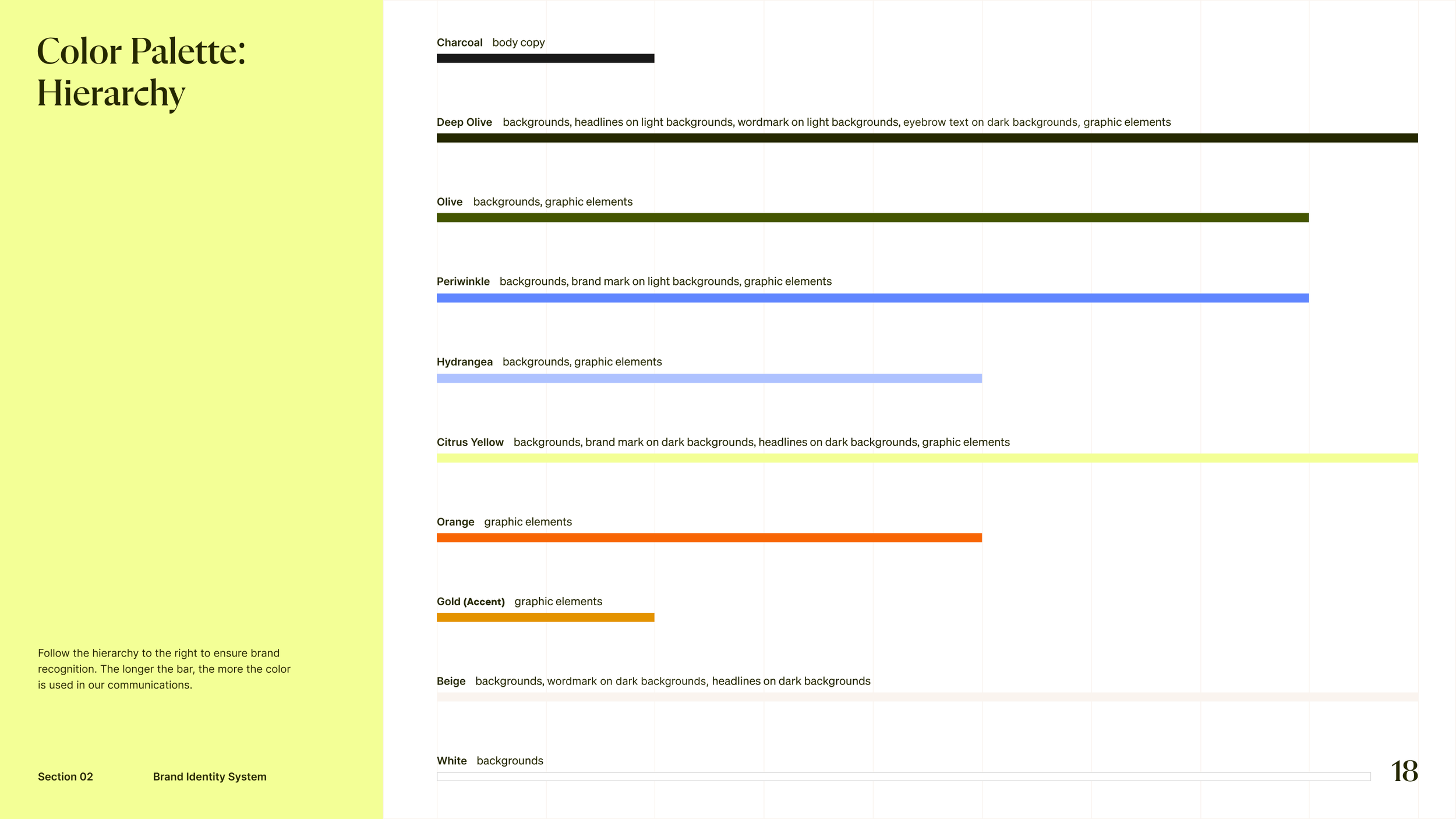
Anchored in deep and mid-tone olive, the Sunfish palette reflects growth and resilience, which are core themes during the IVF journey. Lemon yellow and periwinkle blue serve as our primary brand colors, balancing bright and fresh optimism with communicative care. Calming hydrangea blue and energetic orange act as key accents. A golden pop represents the sun shining on a new chapter. Neutral tones of beige, charcoal, and white provide a mature, clean foundation that encourages openness and transparency.








Updated Brand Guidelines







Enterprise
Teachable Payments