
Project — Branding, 2025
Sunfish Fertility
Sunfish brings supportive guidance, financial clarity, and transparency to the family-building process.
Client
IVF Financing & Support
MY ROLE
AD & Brand Design

Sunfish Fertility
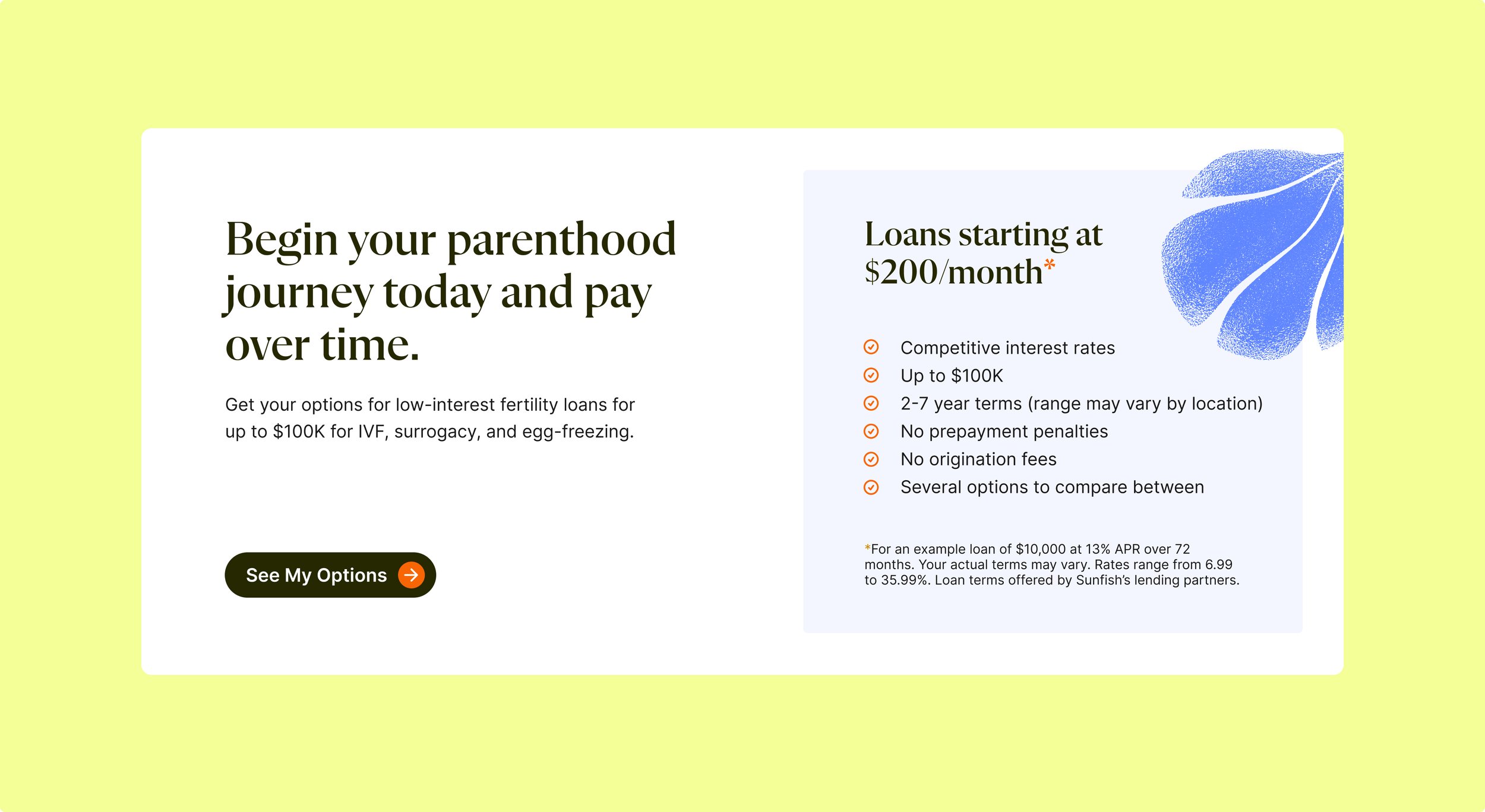
IVF is hard. Navigating it shouldn't be.
IVF is hard. Navigating it shouldn't be.
Sunfish brings expert guidance—financial, administrative, and emotional—to the IVF journey.


The Challenge
Sunfish Fertility is helping self-pay IVF patients with transparent pricing, bundled discounts, and a partial money-back guarantee, all while being a supportive guide during the IVF journey. Keeping in mind 1) the financial aspect of their business, 2) their intention to grow into a company that offers support outside of IVF, such as surrogacy and 3) the emotional challenges of IVF, we needed to create an experience that was functional and trusted in addition to deeply human.
The Solution
We chose to bring the Sunfish mission to life in a way that felt warm and supportive at first glance, allowing hearts to open, knowing that trust would follow. Earthy greens create a sense of calm and grounding while golden, sunlit imagery and gentle, nature-inspired graphics are emotionally in-tune with what people on the IVF journey are going through. The new brand embraces an optimistic tone and reinforces Sunfish’s role as a support that brings light to a challenging path.
Unpack the design decisions that bring this vision to life in the sections that follow…
Results
Sunfish has significantly expanded its IVF Success Program through partnerships with clinics like Pacific Northwest Fertility and Delaware Institute for Reproductive Medicine, making fertility treatments more accessible and financially supported for patients. They’re quickly scaling operations to better serve families.
MY ROLE
Art Director at C42D
Art Direction
Brand Design
Engaged with the whole project cycle, I worked closely with the strategy team during the strategy phase before fully taking over brand design and brand guidelines. I then oversaw applications of the brand as well as website design. As the voice of the brand, I presented all concepts and led internal critiques to refine and elevate the project.
THE TEAM
Brand Strategy Hema Padu
Digital Design Sunfish Internal Team & Tonic
For couples and singles (target audience) seeking assisted fertility (state need or opportunity) Sunfish is (company name) an Assisted Fertility Solution (category) that brings clarity, transparency, and expert guidance (statement of key benefit) unlike fertility clinics (your competitive alternatives) that cannot effectively support patients' end-to-end experience (their drawbacks) Sunfish (better alternative) is your trusted IVF guide that integrates financial, administrative, and emotional support by partnering with a trusted ecosystem of providers and partners (statement of differentiation).
Strategy by Hema Padau


Family Builders
Audience
Sunfish markets their services to those starting families in their late 20s in addition to those pursuing parenthood later in life. Initial outreach is aimed at heterosexual and same-sex female couples, and they have plans to expand support to single parents and male same-sex couples through surrogacy in the future.
In it with you.

VISUAL STRATEGY
Our original color palette played a central role and our first jumping off point: deep and mid-tone olives convey resilience and growth, while citrus tones and periwinkle blues introduce soft brightness and positivity. Golden accents evoke possibility while beige neutrals bring a sense of clarity and transparency. Brick red symbolizes the persistence, strength, and tenacity individuals and couples going through IVF must endure.
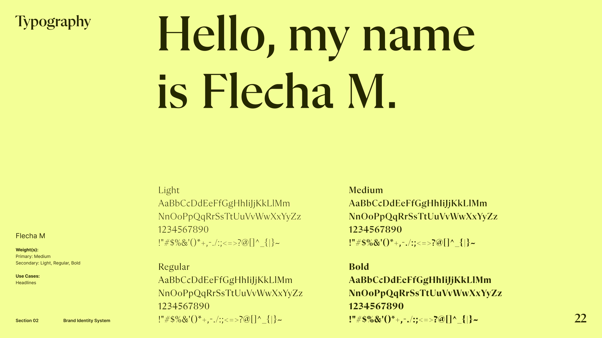
We recommended modern serifs for headings to add a human touch while suggesting body copy be set in easy-to-read sans-serifs, ensuring clarity and approachability.
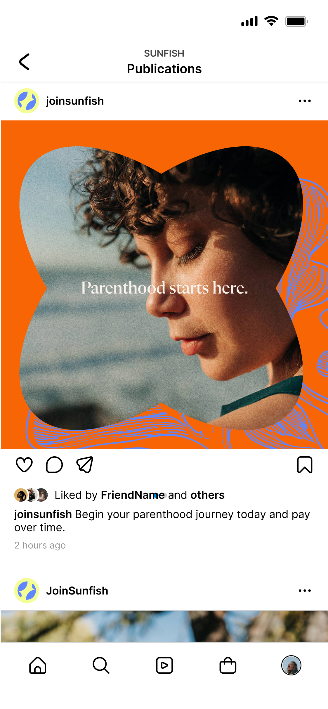
For graphic elements, we were inspired by flowing water and coral forms to symbolize renewal, as well as nod to the company name. These soft, fluid curves evoke a supportive environment and represent the emotional support Sunfish provides.
Combined with sunlit imagery and approachable typography, the design reinforces Sunfish’s role as a reliable, empathetic partner.


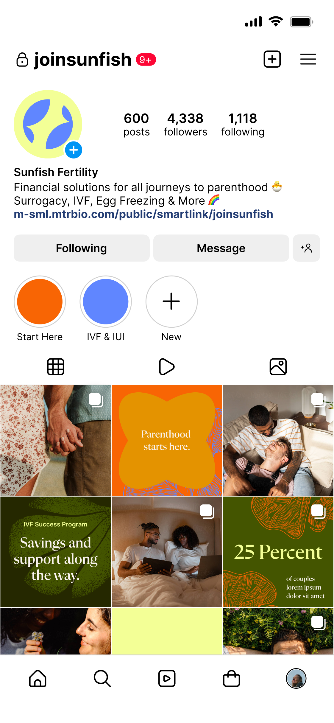
BRAND MARK
The Sunfish brand mark features two fish forming a circle, their bodies gently curled to suggest the silhouettes of babies nest led in a womb. The circle they create can be seen as the egg itself, allowing for layers of meaning within one symbol. The wordmark showcases a modern, sans-serif typeface with soft, elegant curves.


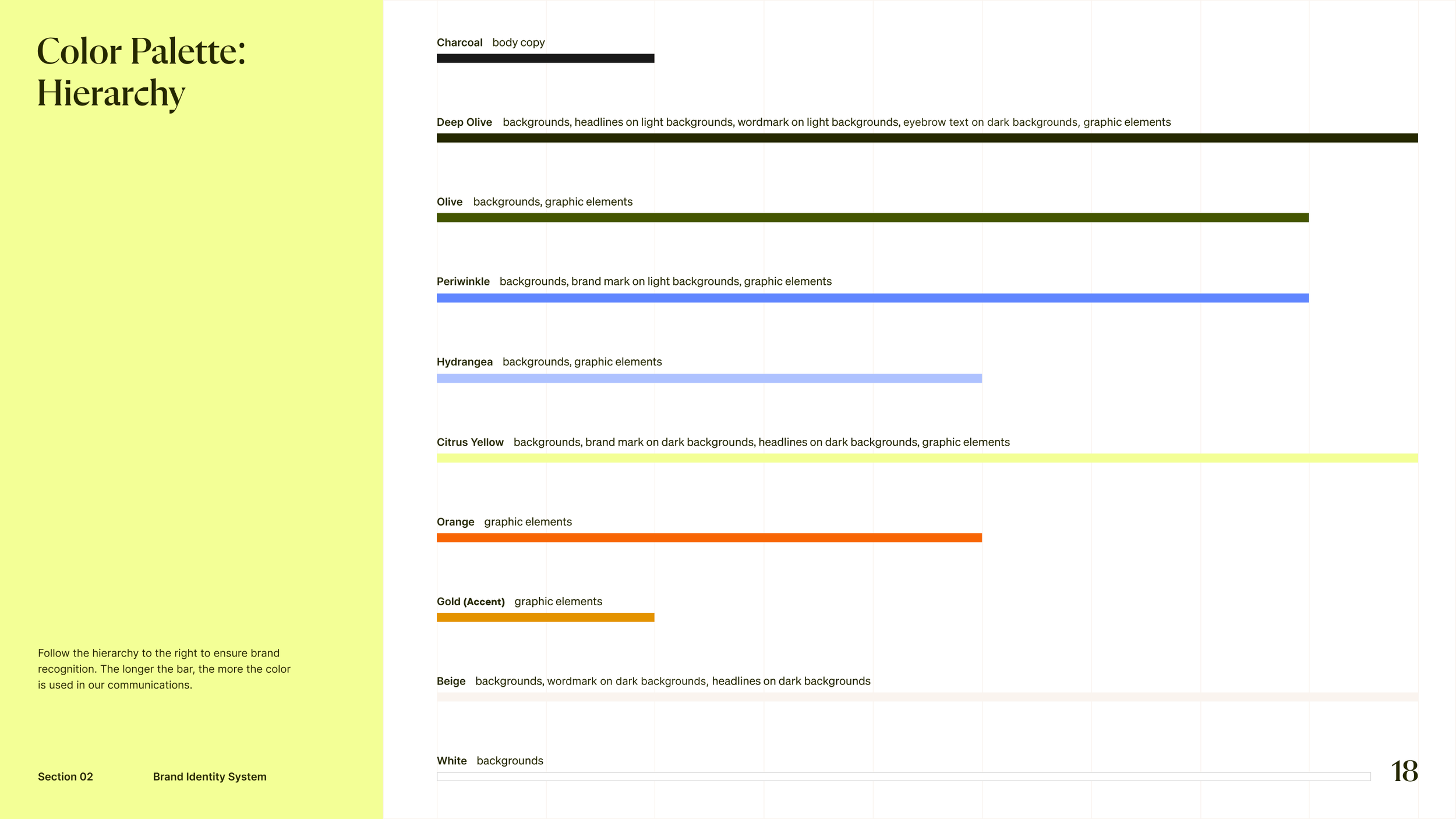
FINAL COLOR PALETTE
Anchored in deep and mid-tone olive, the Sunfish palette reflects growth and resilience, which are core themes during the IVF journey. Lemon yellow and periwinkle blue serve as our primary brand colors, balancing bright and fresh optimism with communicative care. Calming hydrangea blue and energetic orange act as key accents. A golden pop represents the sun shining on a new chapter. Neutral tones of beige, charcoal, and white provide a mature, clean foundation that encourages openness and transparency.


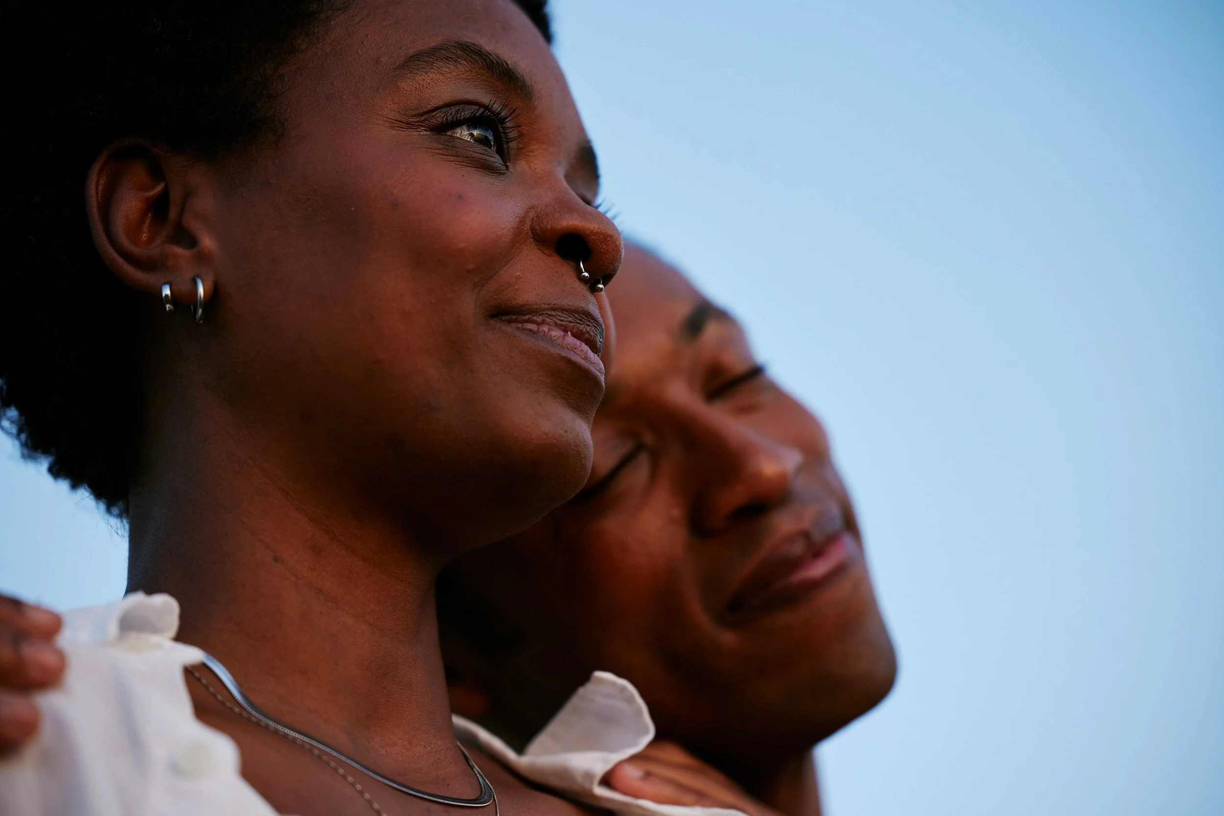


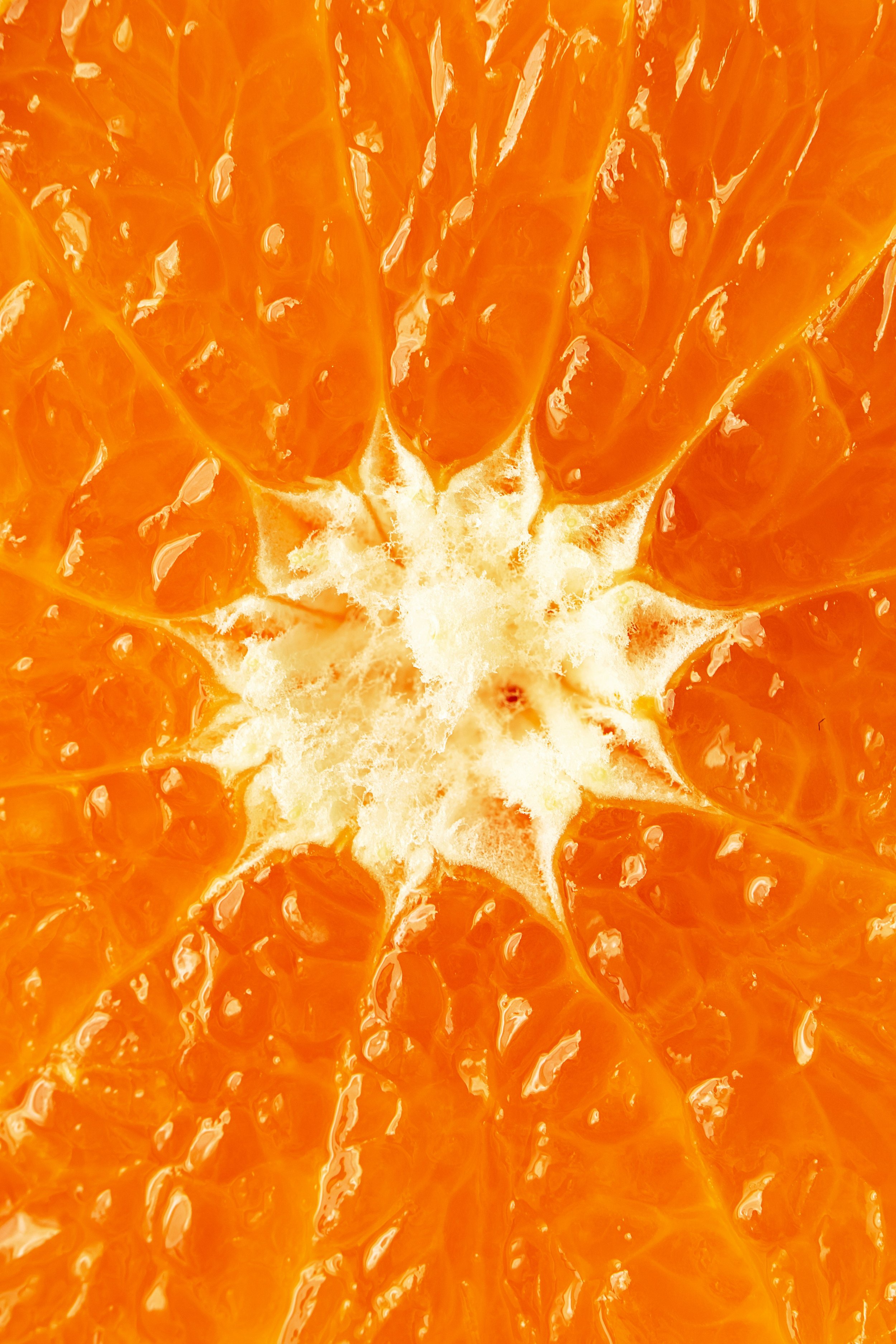
Photography
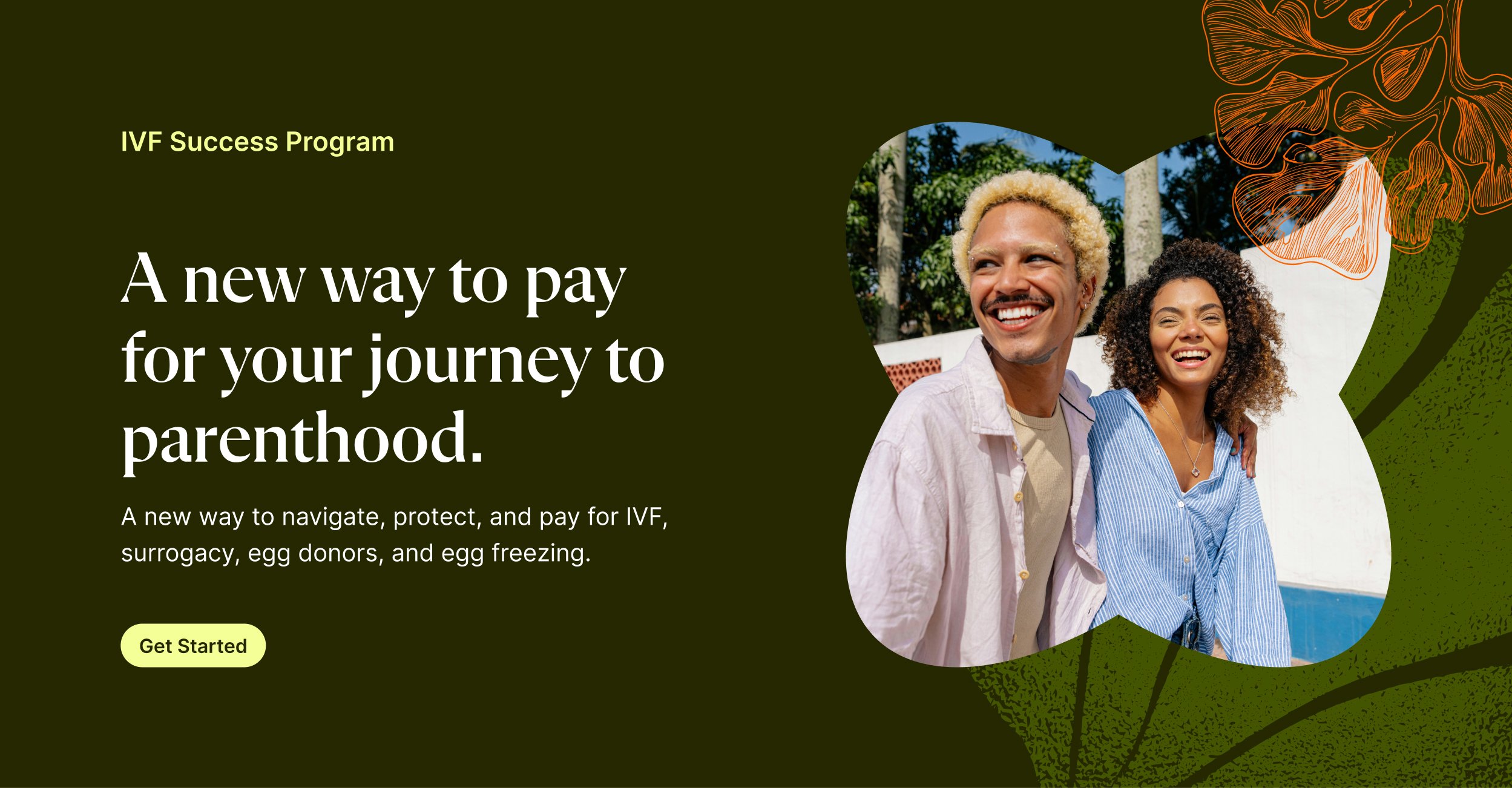
We captured hope through sunlit imagery. Each image is bathed in soft, golden light, evoking optimism. Portraits reflect strength and introspection, while intimate close-ups of couples embracing convey deep connection and unwavering support. Imagery is tender, ensuring every subject’s emotions are seen and understood. This style reinforces Sunfish’s role as a trusted guide who brings light to a challenging path.

Secondary Photography
A secondary imagery style captures couples realistically navigating the IVF journey, as well the surrogacy journey, which will be a future offering. More candid and unfiltered than our sunlit photography, these images reflect the emotional depth of this challenging process by highlighting the quiet moments of research, decision-making, and action.

Graphic Elements
Graphic elements are inspired by coral to symbolize growth and renewal, as well as nod to the company name. These soft, circular botanicals evoke a calm personality that represents the emotional support Sunfish provides.
Tasked with coming up with a secondary graphic element, a lined coral form came to life with the use of Generative AI.