
Project — Branding, 2019
Sage Realty
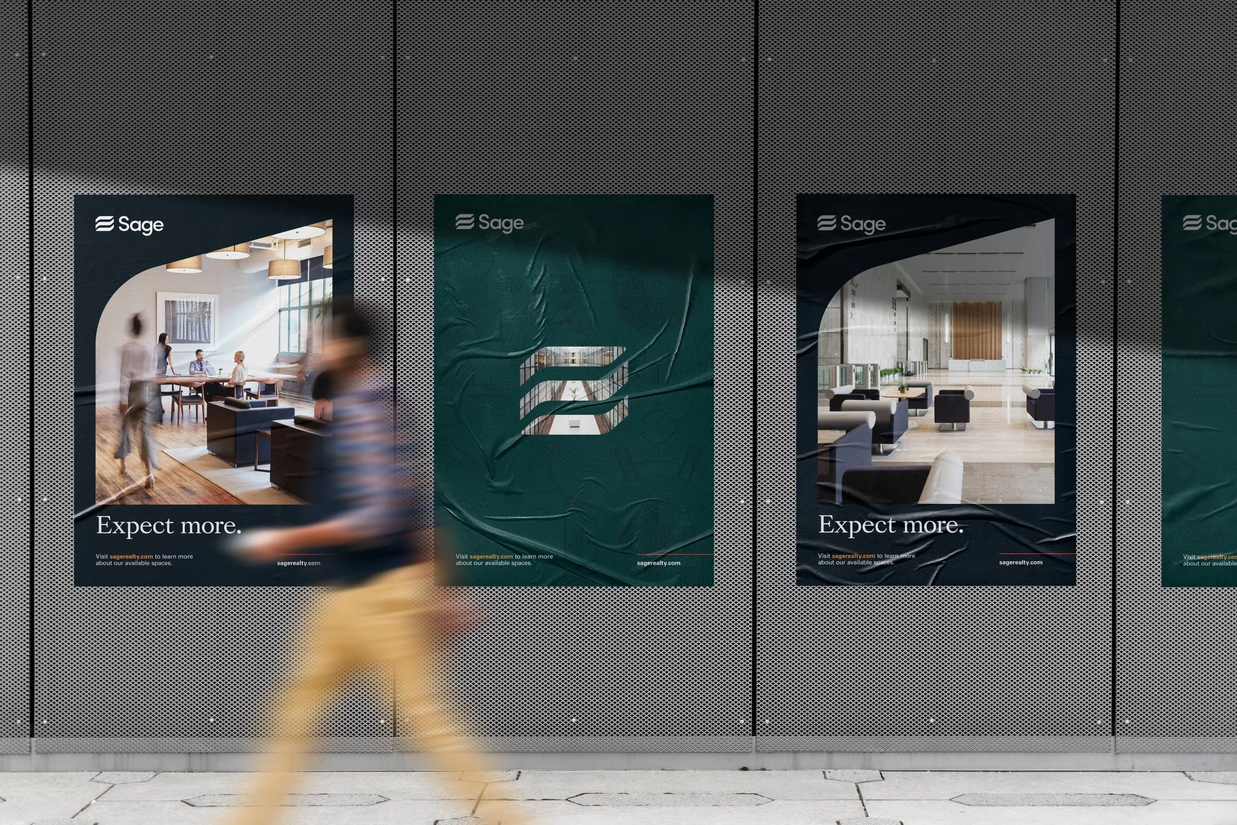
You can expect more from a Sage building.
Client
Commercial Real Estate
MY ROLE
AAD & Brand Design
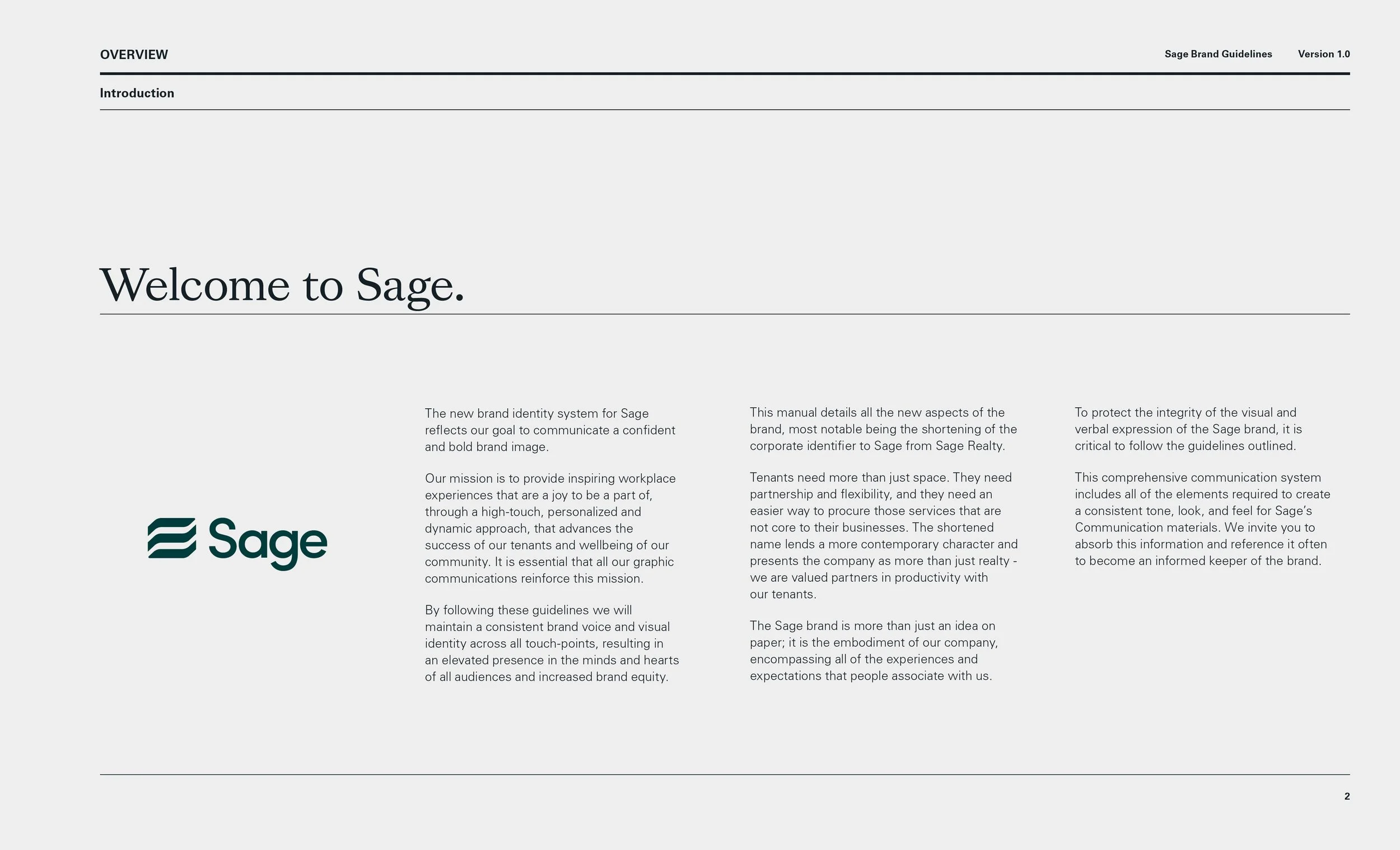
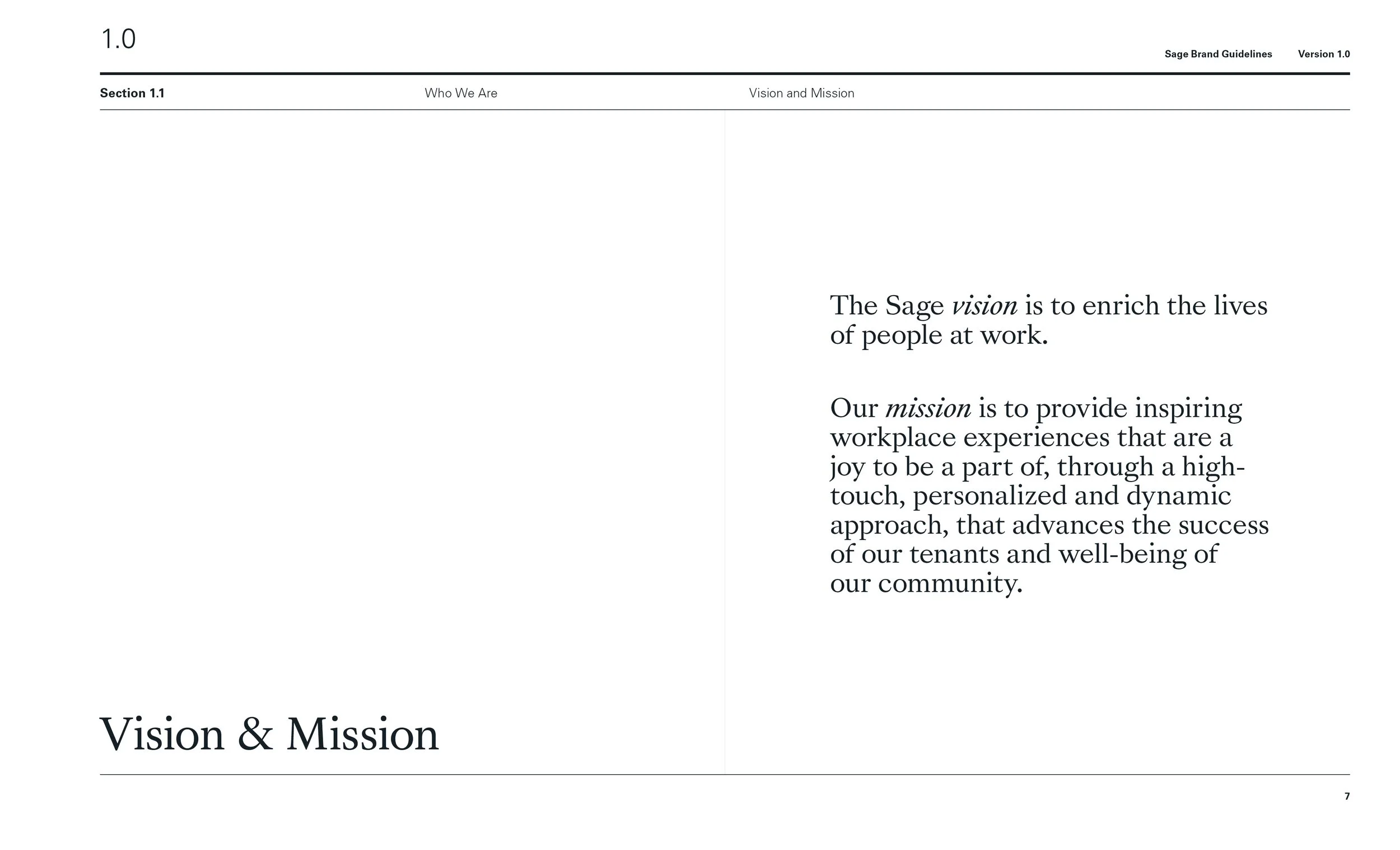
Sage Realty
More here.
More here.
New Yorkers get more from a building managed by Sage.
The Challenge
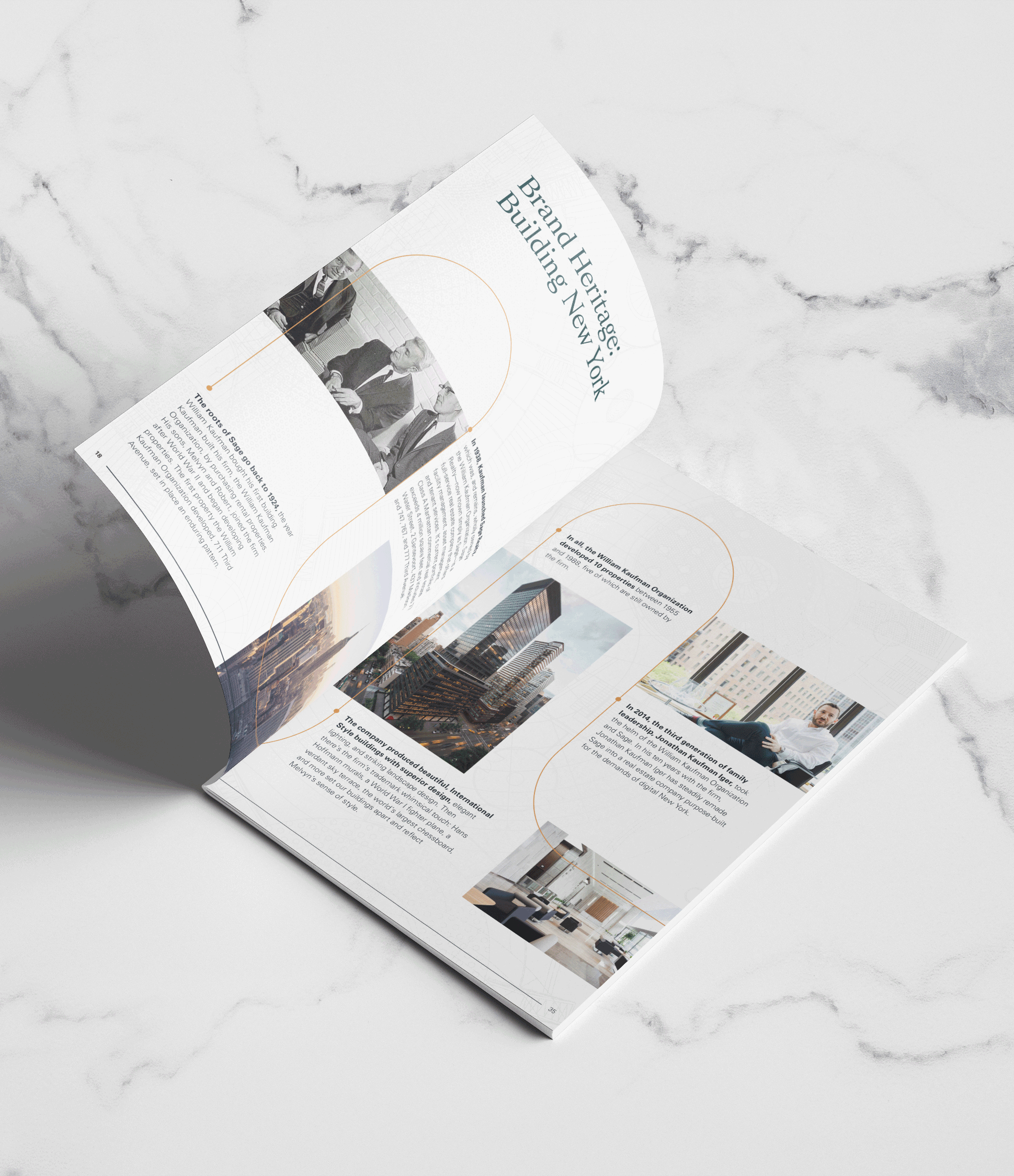
Sage Realty has been a player in Manhattan commercial real estate for over 90 years, but the brand had received few updates since the 1980s. Co-working and membership models were upending traditional real estate and causing a re-shuffling of tenant expectations. New management wanted to re-invent the brand from the ground up to present a new company to employees, investors, tenants, agents, and the modern public. We helped the firm explore its heritage, its soul, and its future in order to create a new Sage, suited to a new era of commercial real estate.
The Solution
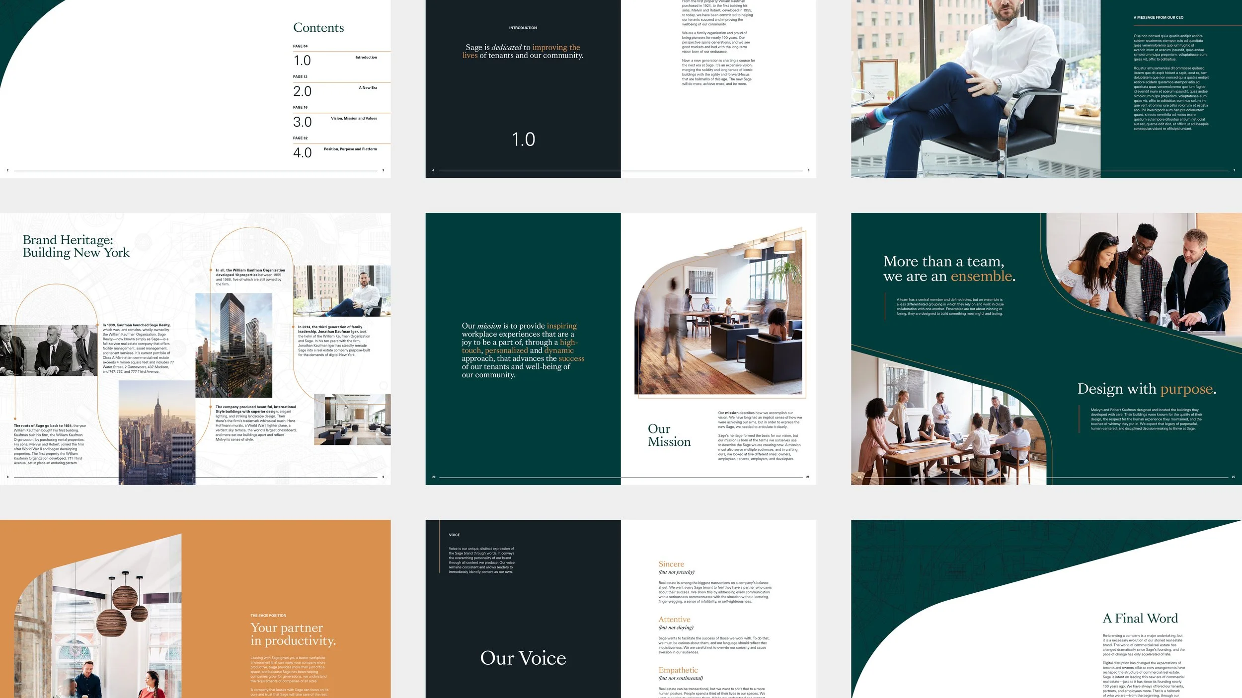
The team landed on the messaging platform of “More Here” as an action-oriented foundation for all brand communications. Each design choice was inspired by this idea of receiving “more” from a Sage building.
Unpack the design decisions that bring this vision to life in the sections that follow…
Results
Since our 2020 rebrand, Sage has held a strong post-COVID financial position with a reported occupancy rate of 99.1% as of August 2023. They also secured $127.5M in financing for 77 Water Street, and earned the 2022 Transformation Award at the VTS Accelerate conference.
MY ROLE
Associate Art Director at C42D
Art Direction
Brand Design
Engaged with the whole project cycle, I worked closely with brand strategists during the strategy phase fully taking over brand design and brand guidelines.
THE TEAM
Brand Strategy Jeremy Katz, Ogilvy
Moodboard

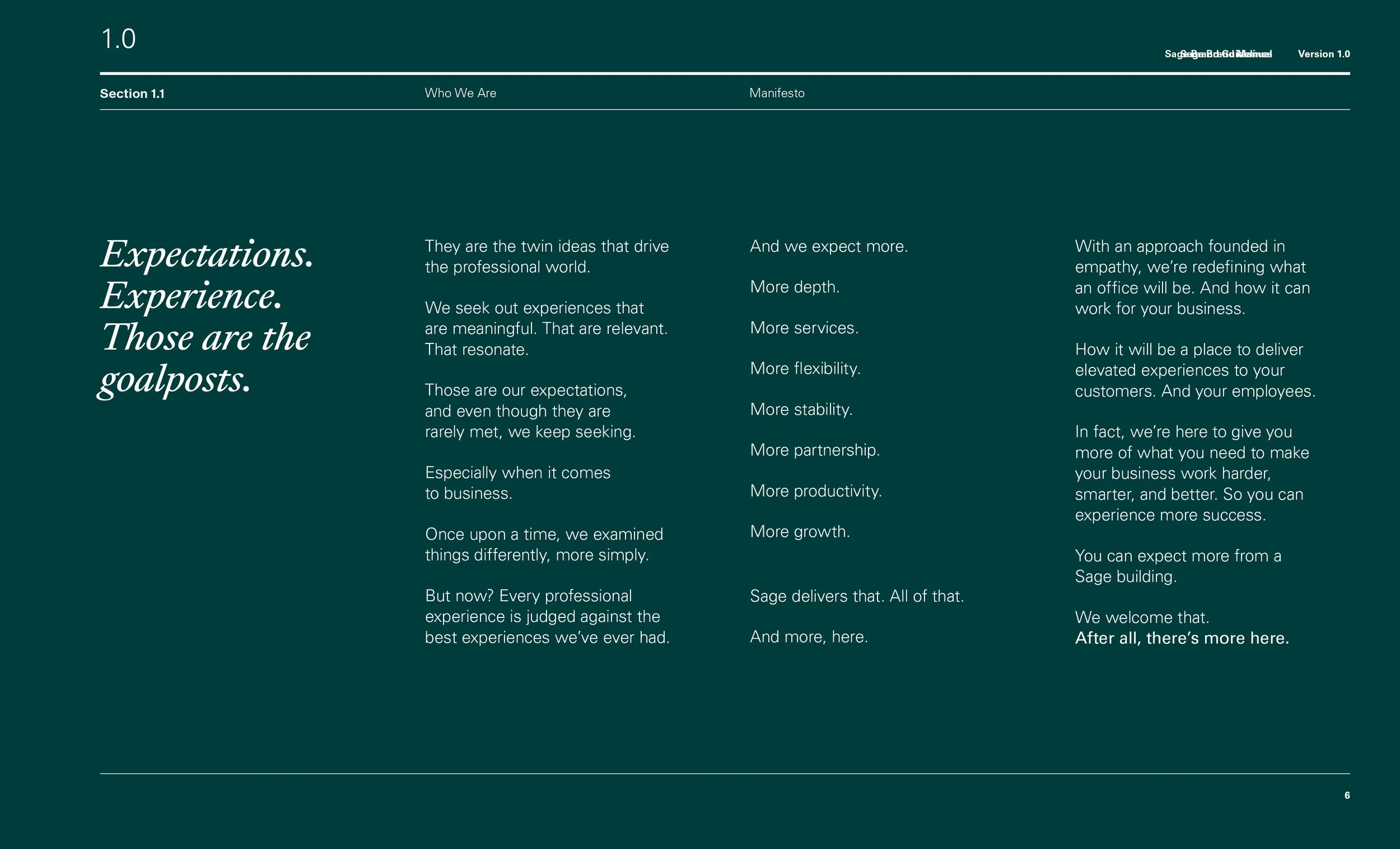
The Sage Manifesto
Expectations. Experience. Those are the goalposts.
They’re the twin ideas that drive the professional world. The tech world. The entertainment world. The whole world.
We seek out experiences that are meaningful. That are relevant. That resonate.
Those are our expectations, and even though they are rarely met, we keep hoping.
Especially when it comes to business.
Once upon a time, we compared things differently, more simply.
But now? Every professional experience is judged against the best experiences we’ve ever had.
And we expect more.
More depth.
More services.
More flexibility.
More stability.
More partnership.
More productivity.
More growth.
Sage delivers that. All of that. And more, here.
We’re redefining what an office will be. And how it can work for your business.
How it will be a place to deliver more experiences to your customers.
And your employees.
In fact, we’re here to give you more of what you need to make your business work harder, smarter, savvier, and smoother.
You should expect more from a Sage building.
We welcome that.
After all, there’s more here.


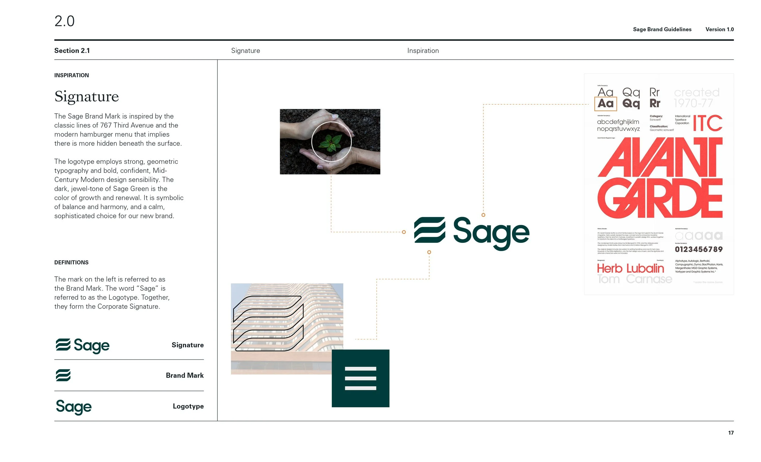
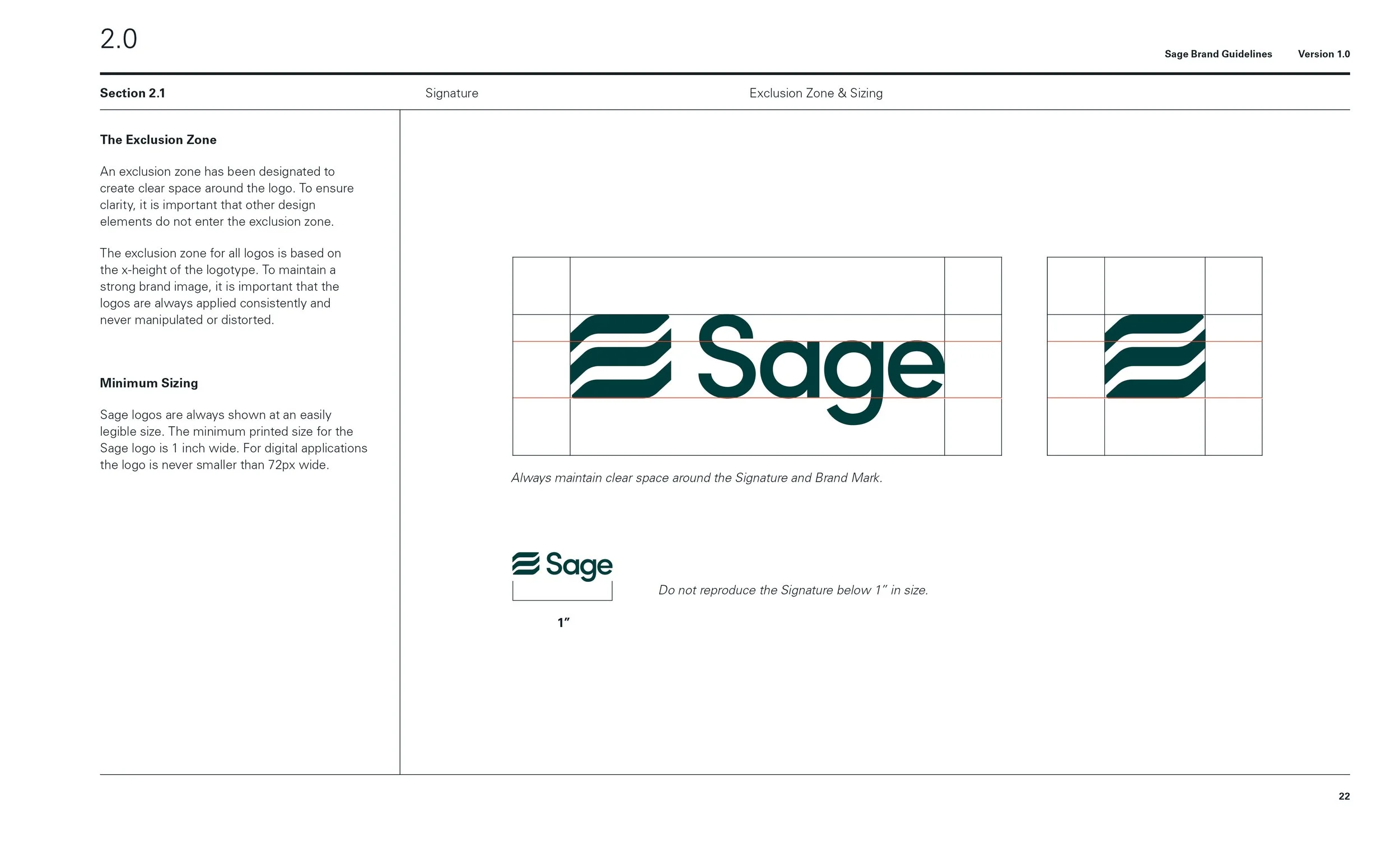
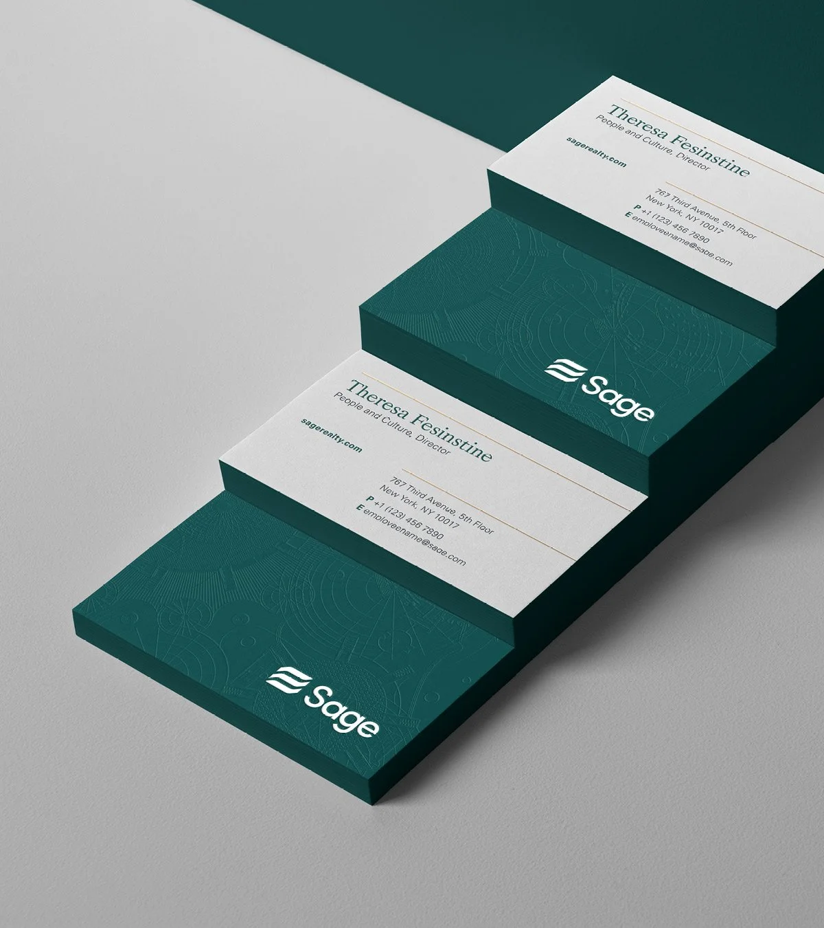
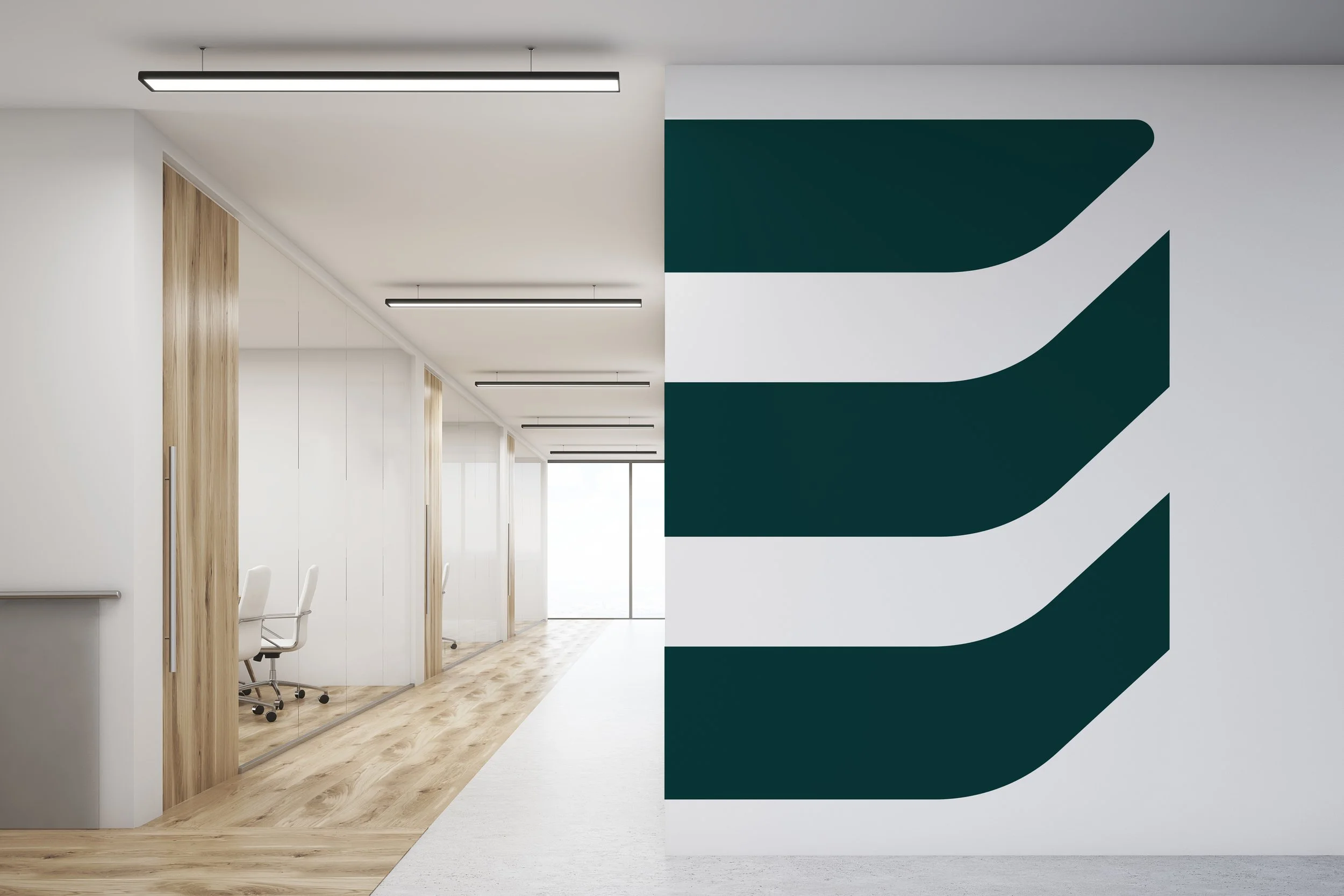
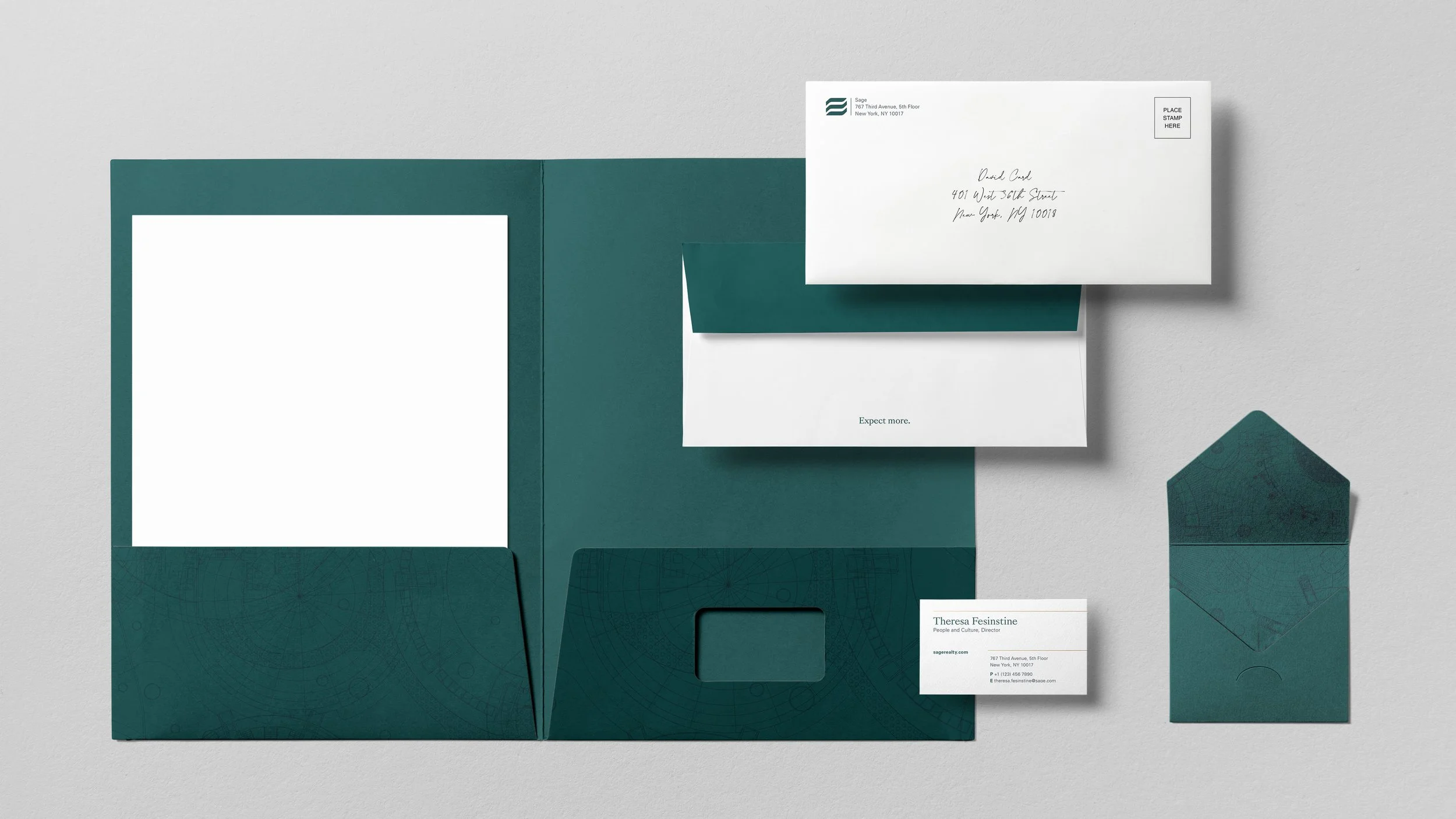
Final Logo Concept
The Sage Brand Mark was inspired by the classic lines of 767 Third Avenue and the modern hamburger menu to imply that there is more hidden beneath the surface. The logotype employs strong, geometric typography and confident, Mid-Century Modern design sensibility.


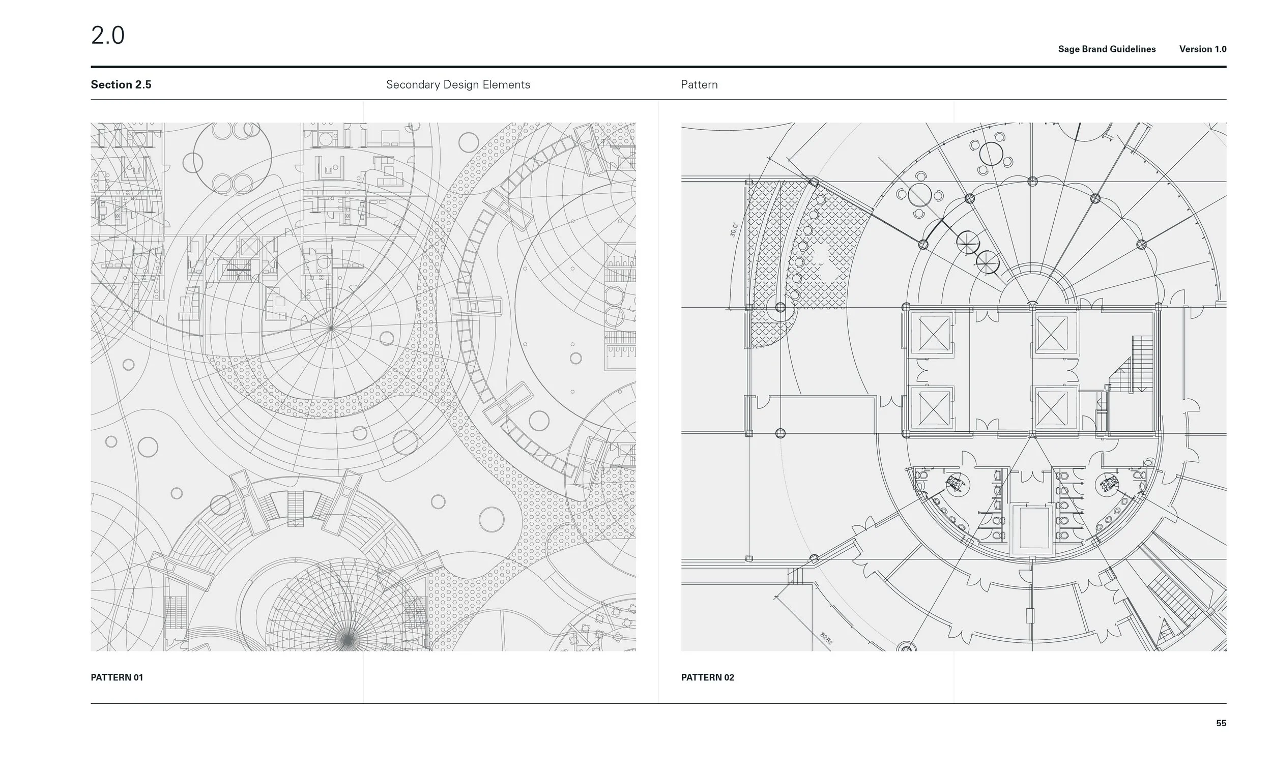
PATTERNS & Graphics
Inspired by the architectural bones of the Sage business, their brand pattern is derived from blueprint documents. In order to differentiate them from other real estate and architectural firms, we employed patterns created with circular shapes as opposed to sharp angles and harsh lines.


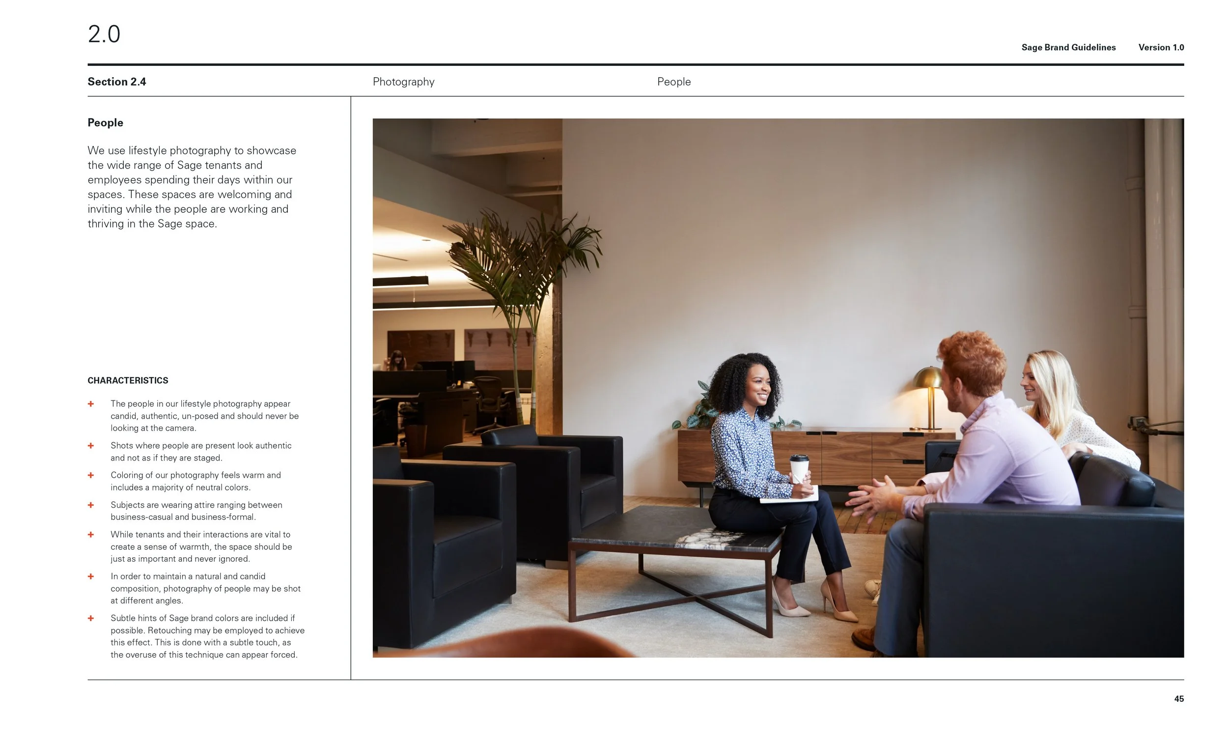
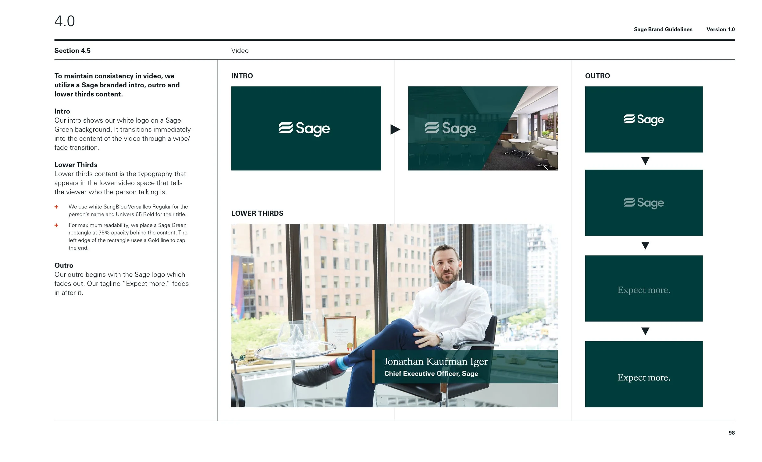
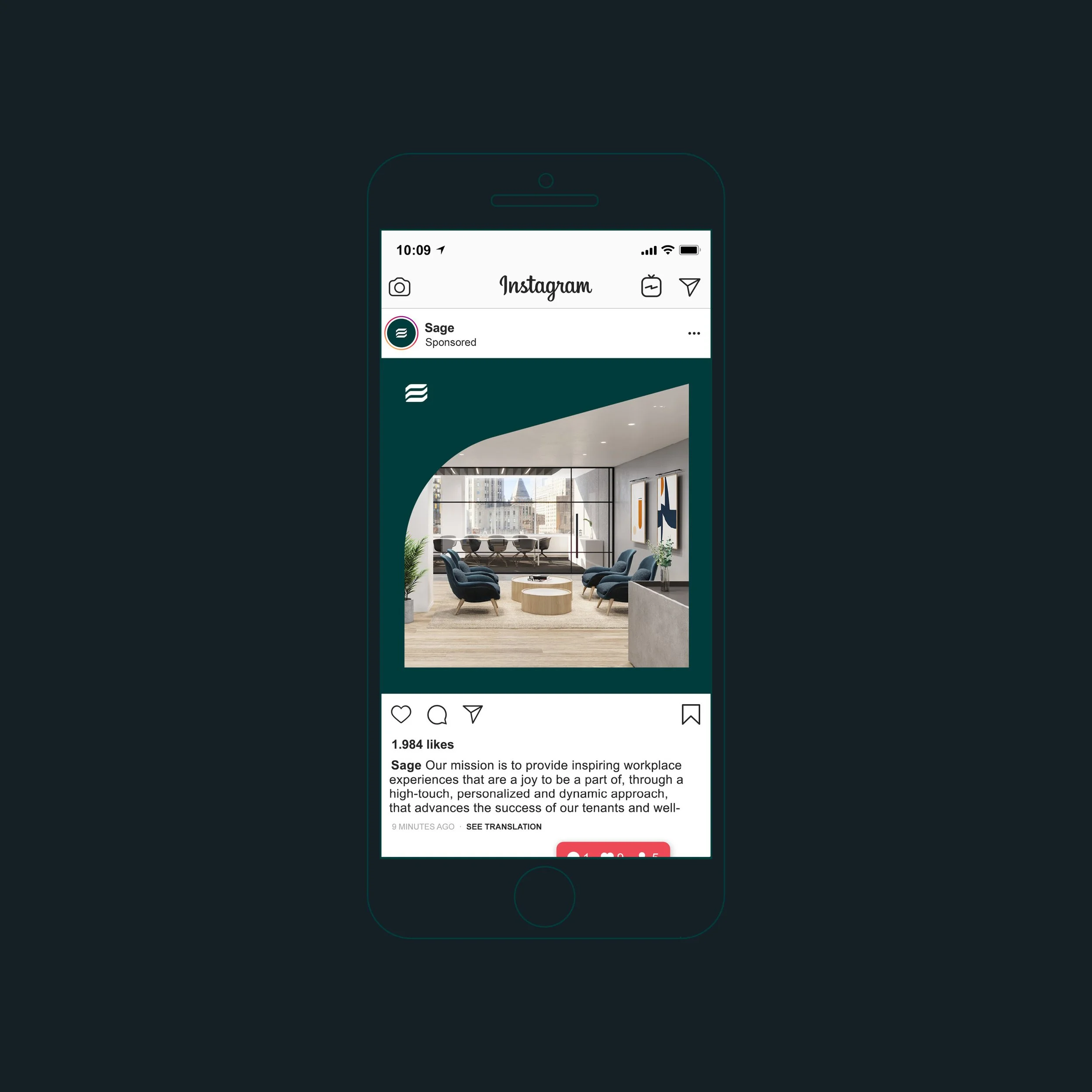
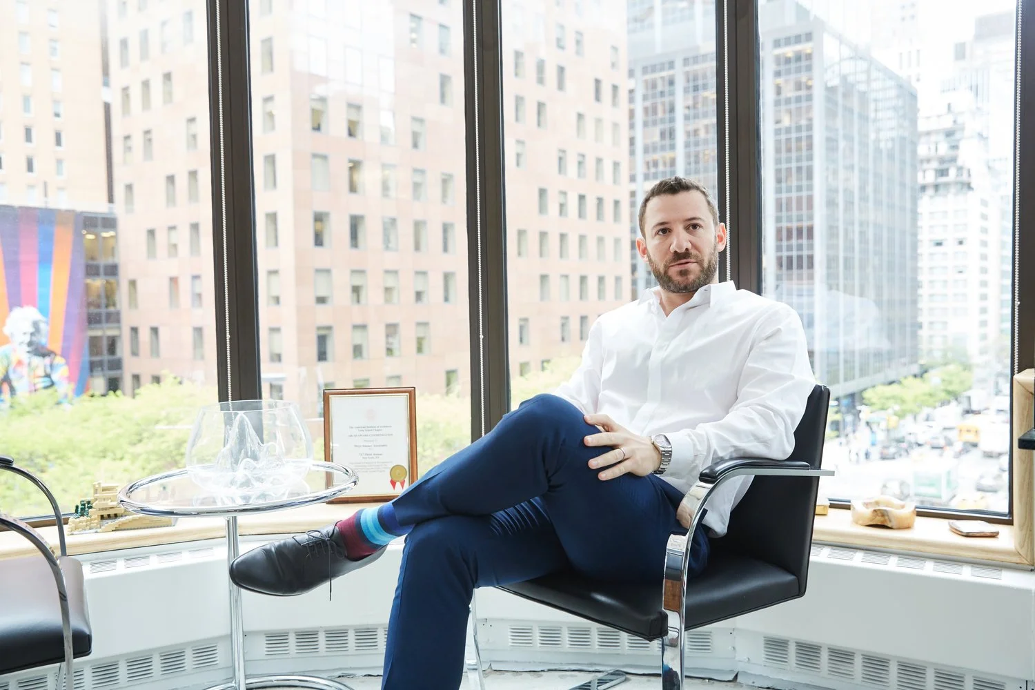
Photography
Sage’s lifestyle photography captures moments where tenants and employees are thriving within well-designed spaces. Warm tones and neutral palettes blend human interaction with the sophistication of the environment.