
Project — Branding, 2025
LightSpun
LightSpun delivers AI-powered automation to provide better patient outcomes, member engagement, and provider experience for dental offices.
Client
Healthcare Admin
MY ROLE
AD & Brand Design

LightSpun
Empowered care through unmatched functionality.
Empowered care through unmatched functionality.
LightSpun is transforming healthcare admin through intelligent automation.

The Challenge
LightSpun delivers AI-powered automation across claims, credentialing, and contact centers so health administration teams can focus on what matters: better patient outcomes, improved member engagement and a seamless provider experience. By utilizing AI, they provide faster, cheaper, and better solutions.
That said, many admin teams are cautious about new technology due to concerns about reliability and the risk of disrupting established workflows. They’re often overburdened and need reassurance that automation will simplify their work, not complicate it. The challenge was to establish credibility and convey that they are a trustworthy, proven partner that is deeply attuned to the realities of healthcare operations and the people behind them.
The Solution
By grounding its message in care as both a value and a practice, we positioned LightSpun to overcome hesitation through genuine care and expertise. The brand doesn’t just talk about improving admin through flashy AI automation; it demonstrates a real understanding of what healthcare administration entails.
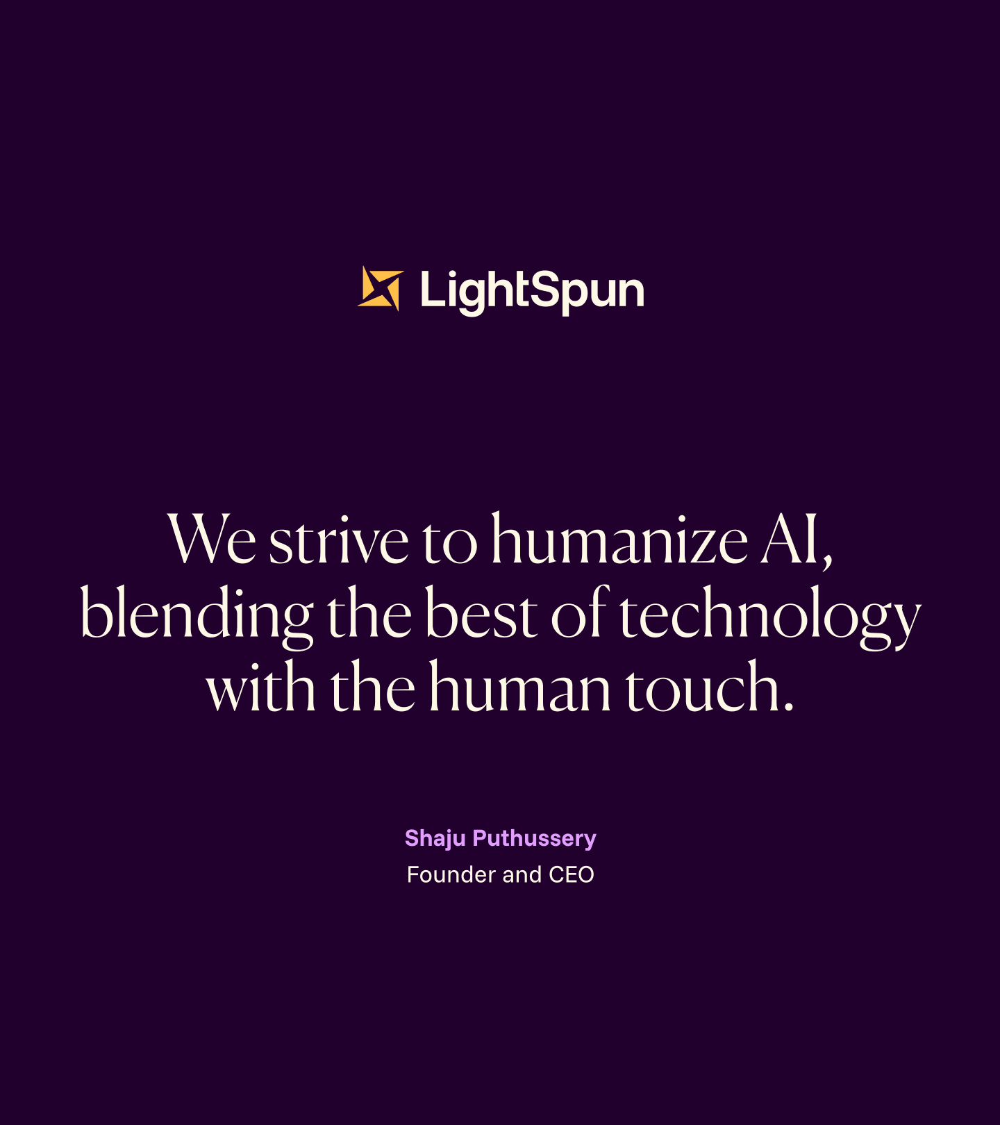
“Empowered Care Through Unmatched Functionality” reflects this dual commitment: to intelligence that drives efficiency and to compassion that preserves humanity. This sincerity, combined with technical precision, helps healthcare teams feel seen, supported, and confident that LightSpun is a trusted partner in delivering better outcomes for everyone.
Unpack the design decisions that bring this vision to life in the sections that follow…
Results
Since their launch in Spring 2025, LightSpun has raised $13 million in Series A funding led by Brewer Lane with Virtue, Cambrian, and Industry Ventures participating
MY ROLE
Art Director at C42D
Art Direction
Brand Design
Involved with the whole project cycle, I worked closely with brand strategists during the strategy phase fully taking over brand design and brand guidelines. I oversaw applications of the brand as well as website design. As the voice of the brand, I'm presented all concepts and led internal critiques to refine and elevate the project.
THE TEAM
Brand Strategy Clinton Barnes, The Connected Agency
Digital Design Justin Cangiano, C42D

Dental Administration
Audience
LightSpun’s audience includes Insurance Payers, Management Services Organizations, Educational and Financial Institutions, and Partnerships.
Preliminary Design
With an event quickly approaching post-Strategy Phase, we whipped up a preliminary identity concept they could use to get the business off the ground and then as a jumping off point for the official Brand Identity Phase.
Moodboard

Functional, Transformational, Trusted, Relatable
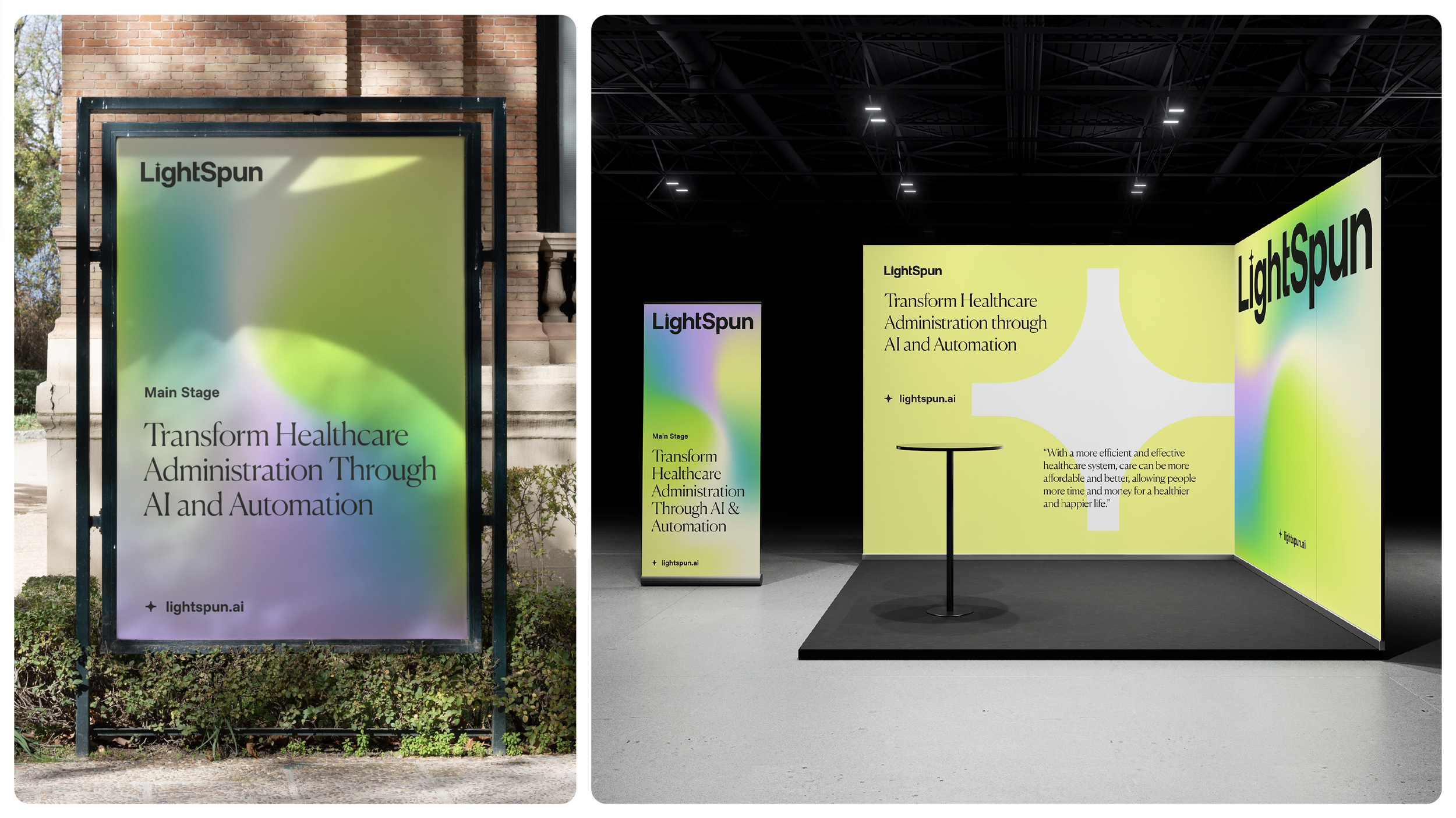
The visual strategy for LightSpun positions the brand as “magically functional.” Rooted in a palette that balances wisdom with performance, the identity reflects both the transformative power of AI and the human-centered values at the brand’s core. Typography reinforces this balance, pairing modern elegance with trust to create a voice that is approachable yet authoritative. Imagery conveys ease, showing healthcare administration and patients in calm, uplifting contexts that highlight the positive impact of streamlined workflows. Across every touchpoint, the system is elegantly simple, making advanced technology feel innovative in addition to being deeply human.
Concept 01
A Spark in the Dark
Concept 01 showcases the "sparkle," commonly associated with AI, within the negative space at the center. Triangular shapes point outward to suggest movement and spinning, symbolizing the transformative power of automation.
Concept 02
Spinning Straw into Gold
Concept 02 is inspired by the spiraling shapes of the Rod of Asclepius and the Caduceus, symbolizing the brand’s industry. This concept represents a multi-channel experience that enables more efficient healthcare administration.
Concept 03
Illuminate (to Eliminate) the Pain Point
Concept 03 utilizes four cursors that represent sparks of light converging at the center. This represents the brand's ability to identify and address pain points in healthcare administration. The negative space in the center forms a subtle AI “sparkle.”


Photography
LightSpun’s technology streamlines workflows for office workers, making their tasks more efficient and freeing up time for patient care. Patients, in turn, experience a transformational shift, with quick, hassle-free access to their healthcare, fostering trust in the system. Bright, natural lighting and soft tones to create a welcoming atmosphere, highlighting how AI functionally improves efficiency, positively impacting patient experiences.