
Project — Branding, 2022
K50 Ventures
Pre-seed capital for purpose-driven companies.
Client
Venture Capital Firm
MY ROLE
AD & Brand Design

K50 Ventures
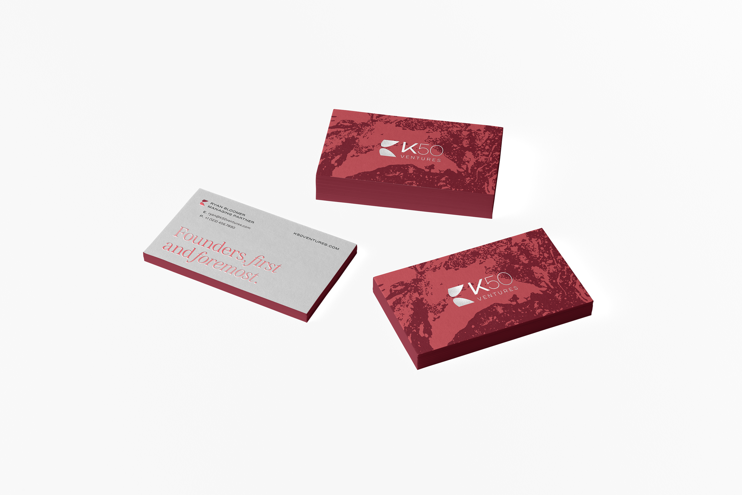
Founders, first and foremost.
Founders, first and foremost.
K50 Ventures invests in founders who believe technology has the potential to unlock access and affordability for the world’s working class.


The Challenge
Having evolved from a fellowship into a venture studio managing over 160 companies, K50 needed to transition its identity to match its new scale and purpose. We were tasked with developing a brand that was approachable and embraced their “Everyman” persona while ensuring the firm’s commitment to "founders first" was clearly communicated.
The Solution
We captured edgy passion, positioning the brand as rebellious yet welcoming. It embraces a spirit of organized chaos, reflecting the dynamic, messy reality of entrepreneurship. The emphasis on real founders first ensures the brand balances aspiration and relatability.
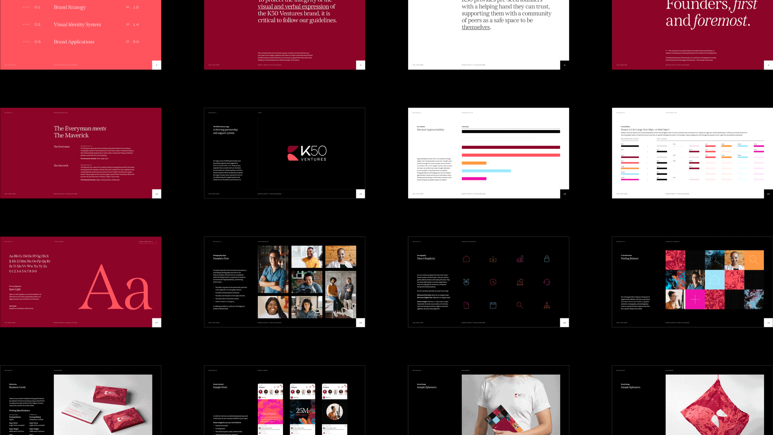
Unpack the design decisions that bring this vision to life in the sections that follow…
Results
K50 Ventures led a $4.5 million Series A investment in Arvo in 2025, expanding its portfolio to over 150 companies across sectors like health and finance, and has supported companies that have collectively reached 2 unicorns, 1 IPO, and 11 acquisitions, such as Republic, Cera, and Mammoth
MY ROLE
Art Director at C42D
Art Direction
Brand Design
Engaged with the whole project cycle, I worked closely with the strategy team during the strategy phase before fully taking over brand design and brand guidelines. I then oversaw applications of the brand as well as website design. As the voice of the brand, I presented all concepts and led internal critiques to refine and elevate the project.
THE TEAM
Brand Strategy Christina Papale, Verboten Group
Digital Design TJ Knight, C42D


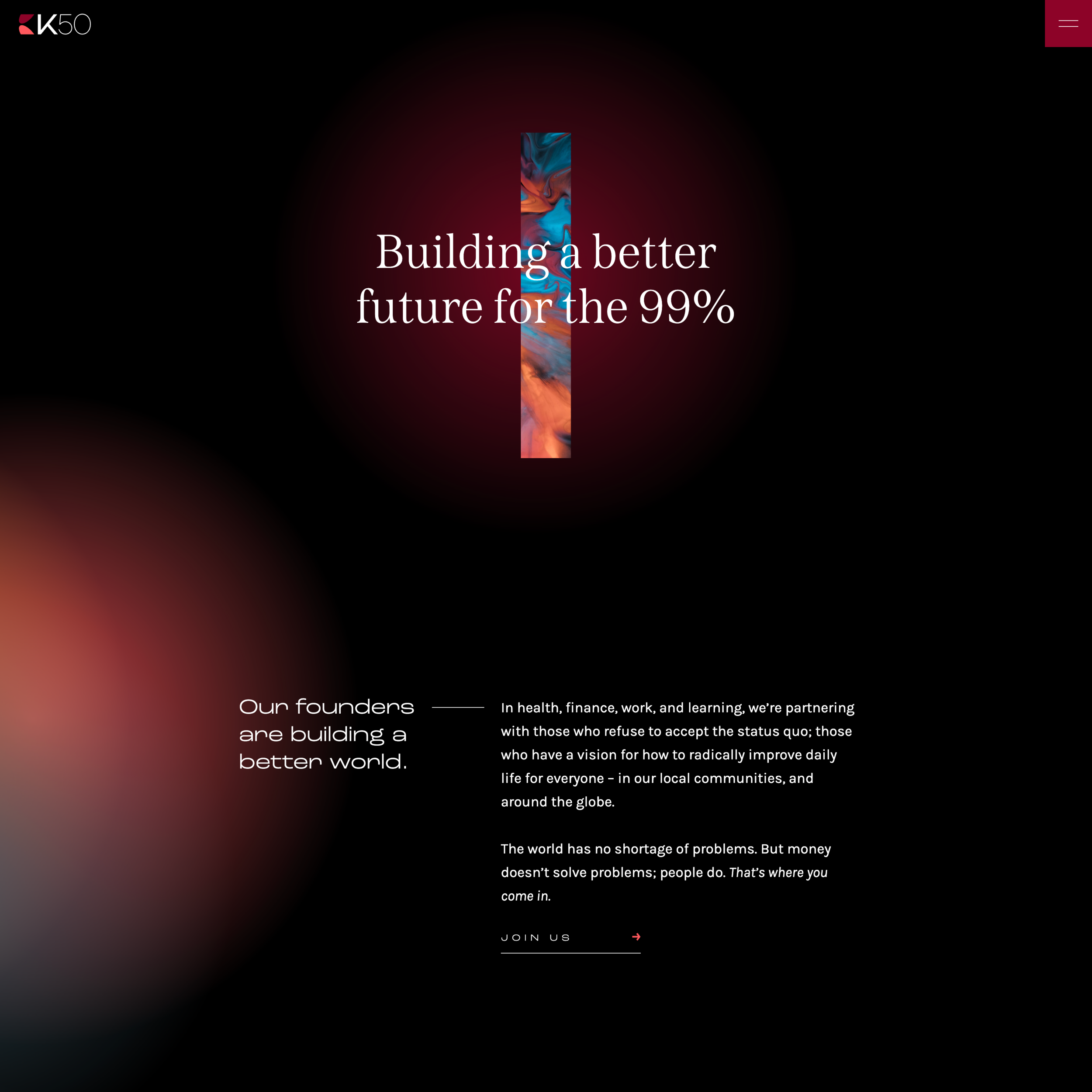
Founders Serving the 99%
Audience
K50 serves founders who’ve seen or experienced the problems they’re solving firsthand. This closeness to the challenge drives impact because the founder insight is authentic. These founders are more than entrepreneurs, they are people passionate about solving problems that serve basic human needs.
Moodboard

Elevated Approachability
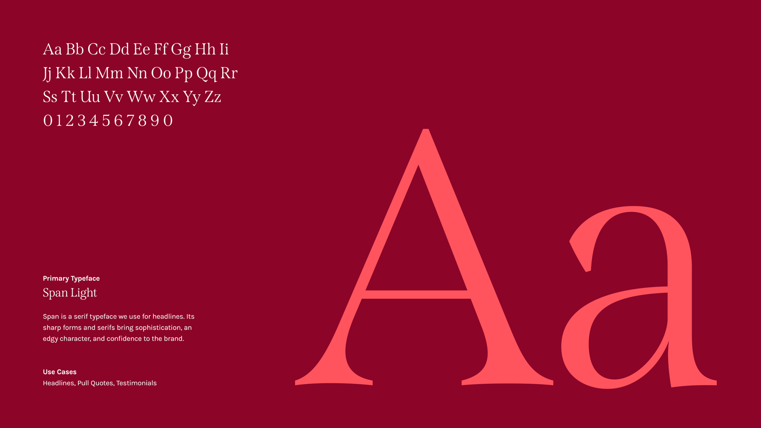
The creative direction for K50 Ventures emphasizes "elevated approachability." Approachability comes first through warm and inviting tones before bringing the vibrancy of the colors up a notch to let an inner bravery shine through and create differentiation within the market. Rich, elegant maroon and a sophisticated serif anchors the brand and conveys the heart that K50 exhibits every day through dedication to their clients while grungy textures embrace their nonconformist tendencies.

“We are true partners that have our founder’s backs, shining a light on what they don’t know, while genuinely supporting the challenges they’ve devoting their lives to.”
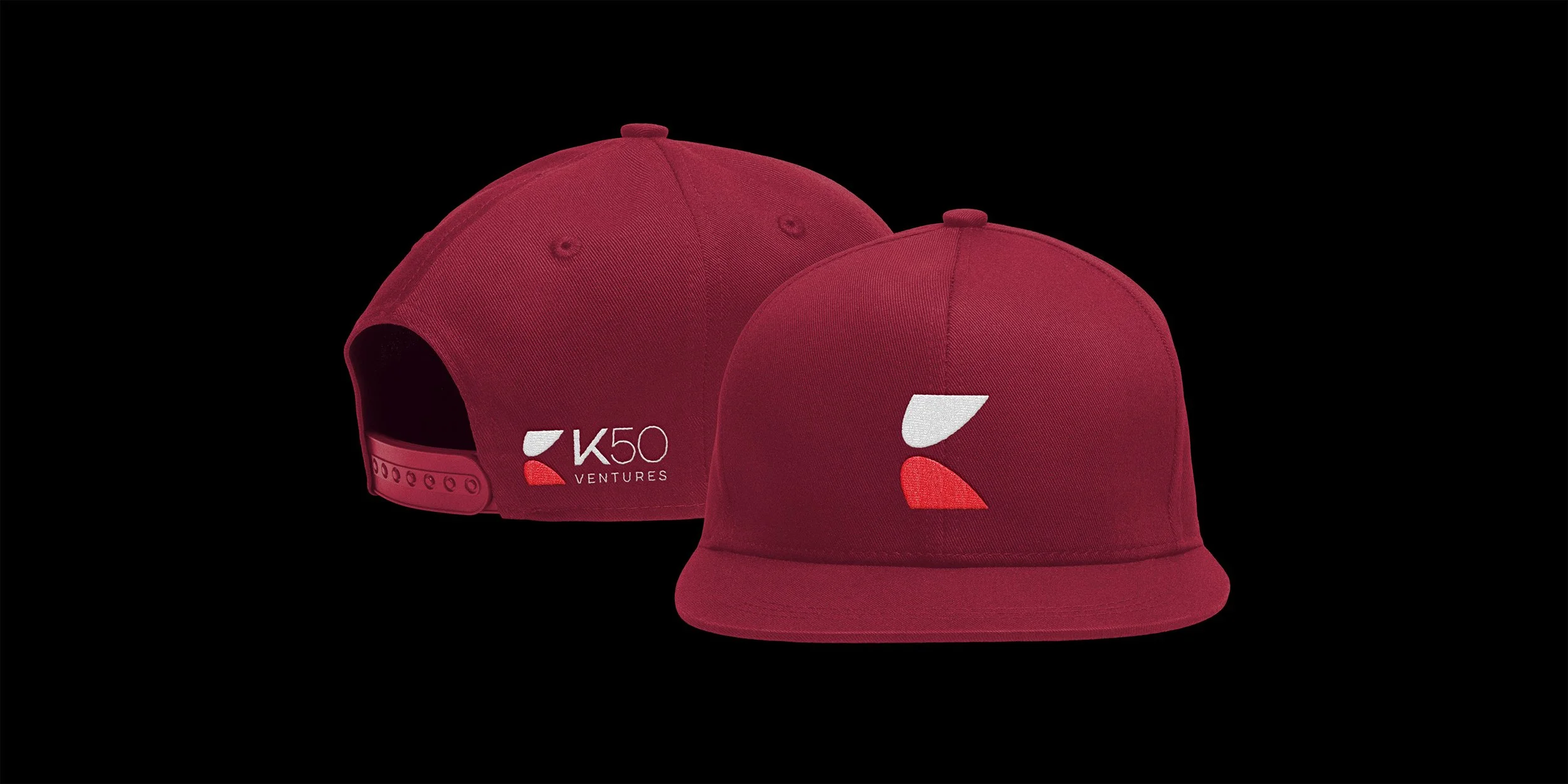
Two oblong spotlight shapes form a partnership in the center, resulting in a “K” brand mark composition. The mark is paired with an uppercase, authoritative wordmark, creating a lockup that leads with fearless confidence.
Chosen Identity Concept