
Project — Branding, 2025
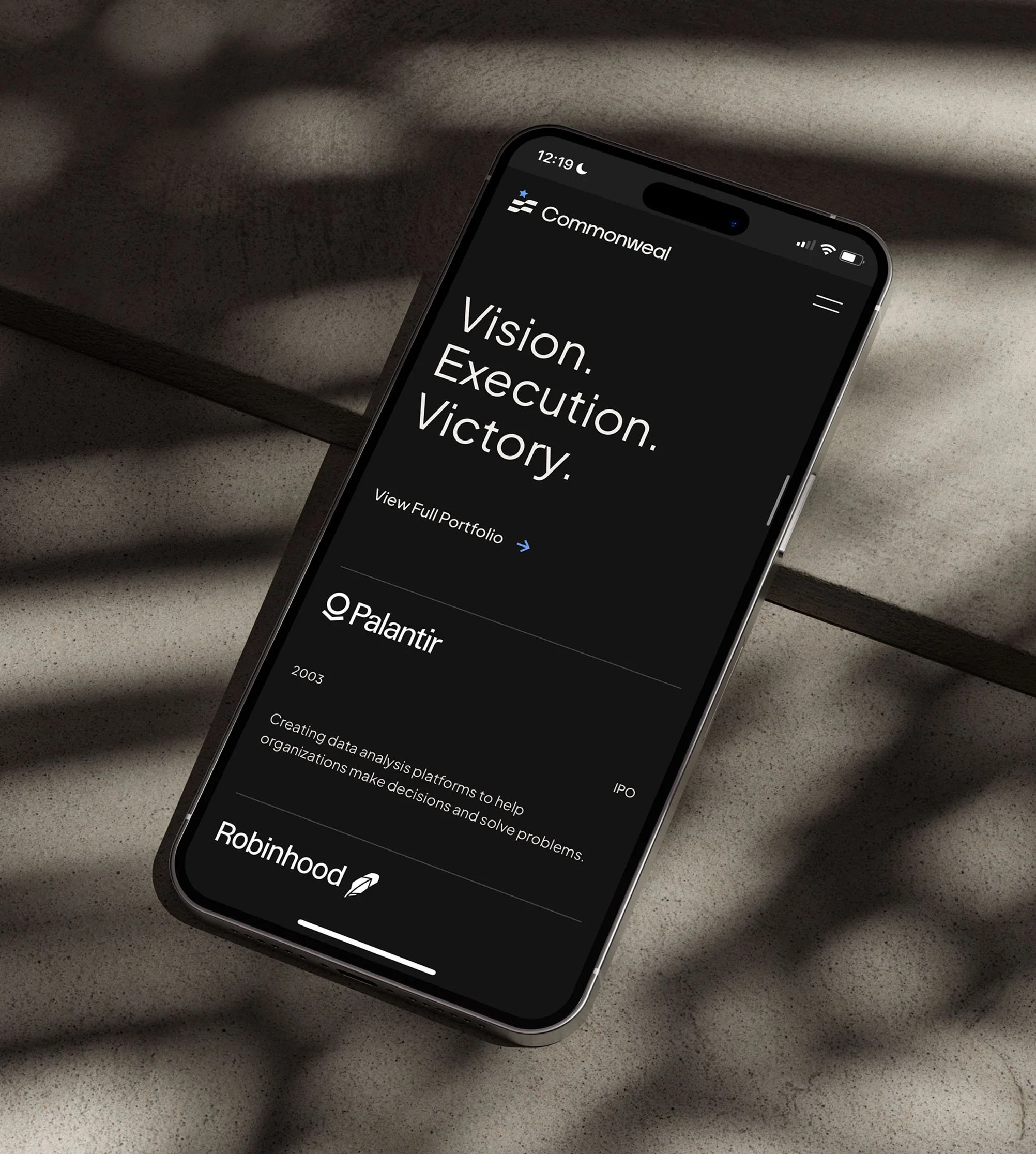
Commonweal
Helping category-winning companies partner with the government to solve the nation’s toughest challenges.
Client
Venture Capital Firm
MY ROLE
AD & Brand Design
Commonweal
Powered by patriotism.
Solve by doing.
Build connections.
Try something.
Forge ahead.
Powered by patriotism. Solve by doing. Build connections. Try something. Forge ahead.
Commonweal accelerates growth for early-stage companies by tapping into government strengths.

The Challenge
Commonweal guides founders to find the right moment, rally the right people, and move all the necessary pieces into place to solve the toughest challenges facing America. Founded by Managing Partner Nate Loewentheil, who served in the Obama White House as a Special Assistant to the President at the National Economic Council, Commonweal leverages government partnerships and invests between $500,000 and $2 million in pre-seed and seed stage companies every year. The goal was to achieve a brand that celebrates patriotism and government partnerships at a time when it can feel taboo to do so.
The Solution
The final brand is designed to communicate a sense of positivity around patriotism and the government, showcasing it as a valuable partner. An avenue to create change. The visual elements, including a no-nonsense typographic system and an Americana color palette, are strategically chosen to convey the organization's mission of rallying around a shared purpose for the common good. The graphic and photography styles further reinforce this approach by illustrating Commonweal as a "force multiplier" that brings together the right people to create rippling and lasting change.
Unpack the design decisions that bring this vision to life in the sections that follow…
MY ROLE
Art Director at C42D
Art Direction
Brand Design
Engaged with the whole project cycle, I worked closely with the strategy team during the strategy phase before fully taking over brand design and brand guidelines. I then oversaw applications of the brand as well as website design. As the voice of the brand, I presented all concepts and led internal critiques to refine and elevate the project.
THE TEAM
Brand Strategy Mannafest Media
Digital Design TJ Knight, C42D


Resolute Founders &
Broad-Minded Investors
Audience
Commonweal’s audience is made up of founders and investors who share a deep commitment to tackling the nation’s challenges. These founders are determined to scale impactful solutions, knowing that true change requires both persistence and large-scale success. Investor partners see government as a force for good, believing that profit and progress can coexist, and they seek out opportunities with the potential to drive meaningful impact.
Moodboard

"We bring together circumstances, people, and insights, to reveal big opportunities for founders’ growth and success. We can see how everything fits and piece it together with precision."
Invest in what matters for America.
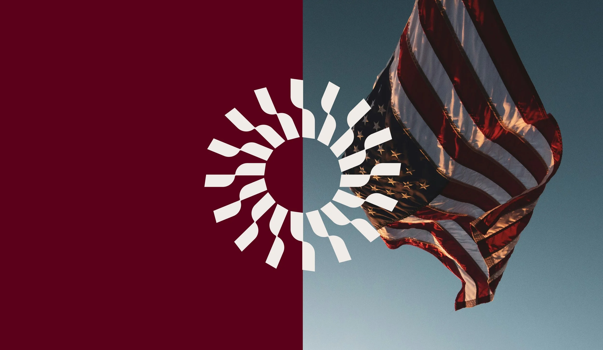
We landed on utilitarian sans-serifs to project a "roll up our sleeves" mentality and humble approachability, symbolizing a direct and efficient communication style. The patriotic color palette, featuring burgundy, bright blue, and striking red, was chosen to subtly balance a sense of urgency and established credibility. The graphic style centers on concentric circles that visually represent the bringing together of people and insights to create a ripple effect of progress. Finally, the photography style focuses on warm, optimistic lighting to capture moments of impact and forward momentum, reinforcing the brand's role as a beacon of hope.

Visual Audit: Logo

Chosen Identity Concept
Creating Waves of Change
The Commonweal team, network, and their portfolio companies navigate shifting political landscapes and face big challenges together. They’re not just walking, they’re advancing with intention, foresight, finesse, and a deep commitment to our country.
We anchored to a star motif in all three concepts to symbolize excellence and achievement. This visual implicates Commonweal as a North Star for the companies they work with. In the final concept, a flag leads the way by rising to the occasion to meet the moment.

Alternate Concept
Piece your plan together with precision.

Alternate Concept
Navigate Networks. Unlock Opportunities.


COLOR PALETTE
We decided to lean into what Commonweal is most passionate about: patriotism. Bright red ignites passion and drives momentum, while burgundy, often used in prestigious, collegiate settings, adds an air of established credibility, crucial in the competitive world of venture capital. These bold hues are balanced by light blue, warm gray, and white, representing open communication, intuitive decision-making, and humble leadership. A cool black grounds the palette, signifying determination, focus, and authority. Together, these colors unite founders, investors, and government in advancing American innovation for the common good.
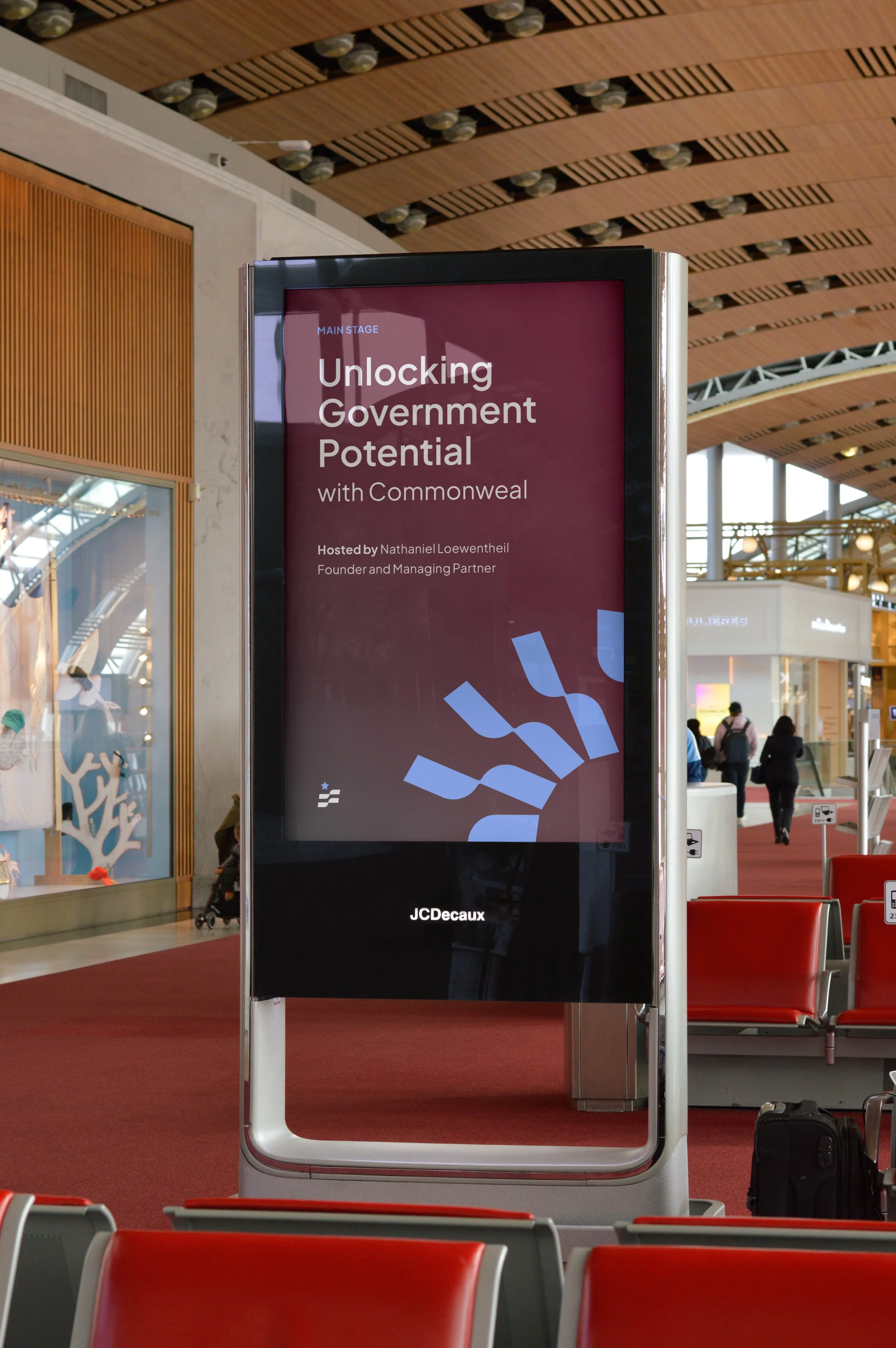
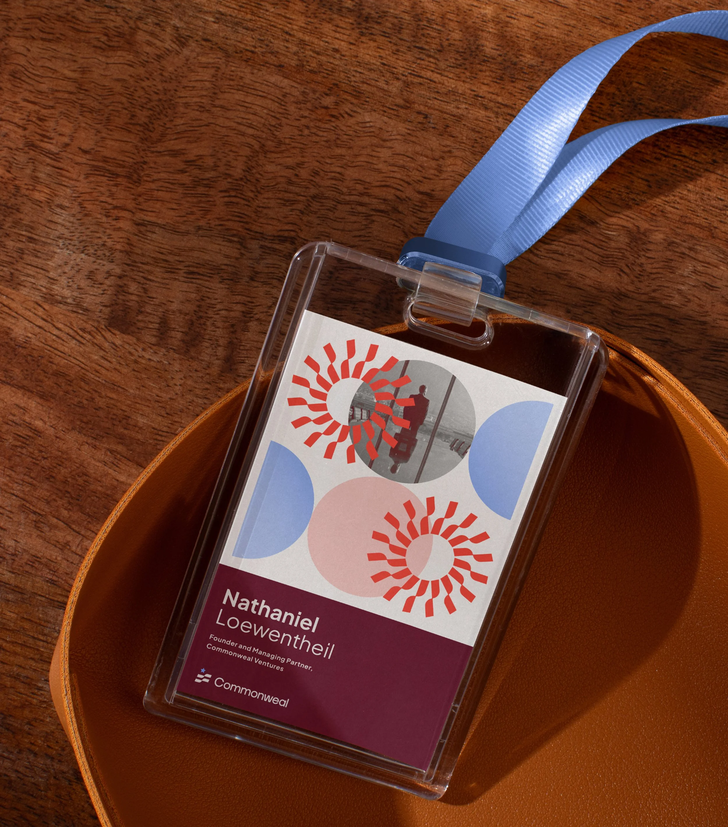
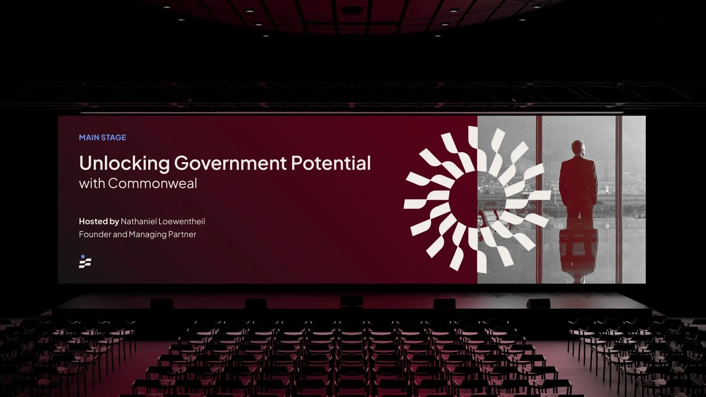
PATTERNS & Graphics
Created using the forms of the logo, concentric circles that come together in harmony create the primary brand graphic. This visual metaphor illustrates Commonweal as a force multiplier that fosters strong, strategic, and enduring partnerships which unlock value across local, state, and federal government levels. At the center the circle lies a core that generates a pulsing ripple effect. These rippling shapes converge at a central point, the right moment, while others expand outward, expressing progress at scale and amplification of impact.