
Project — Branding, 2024
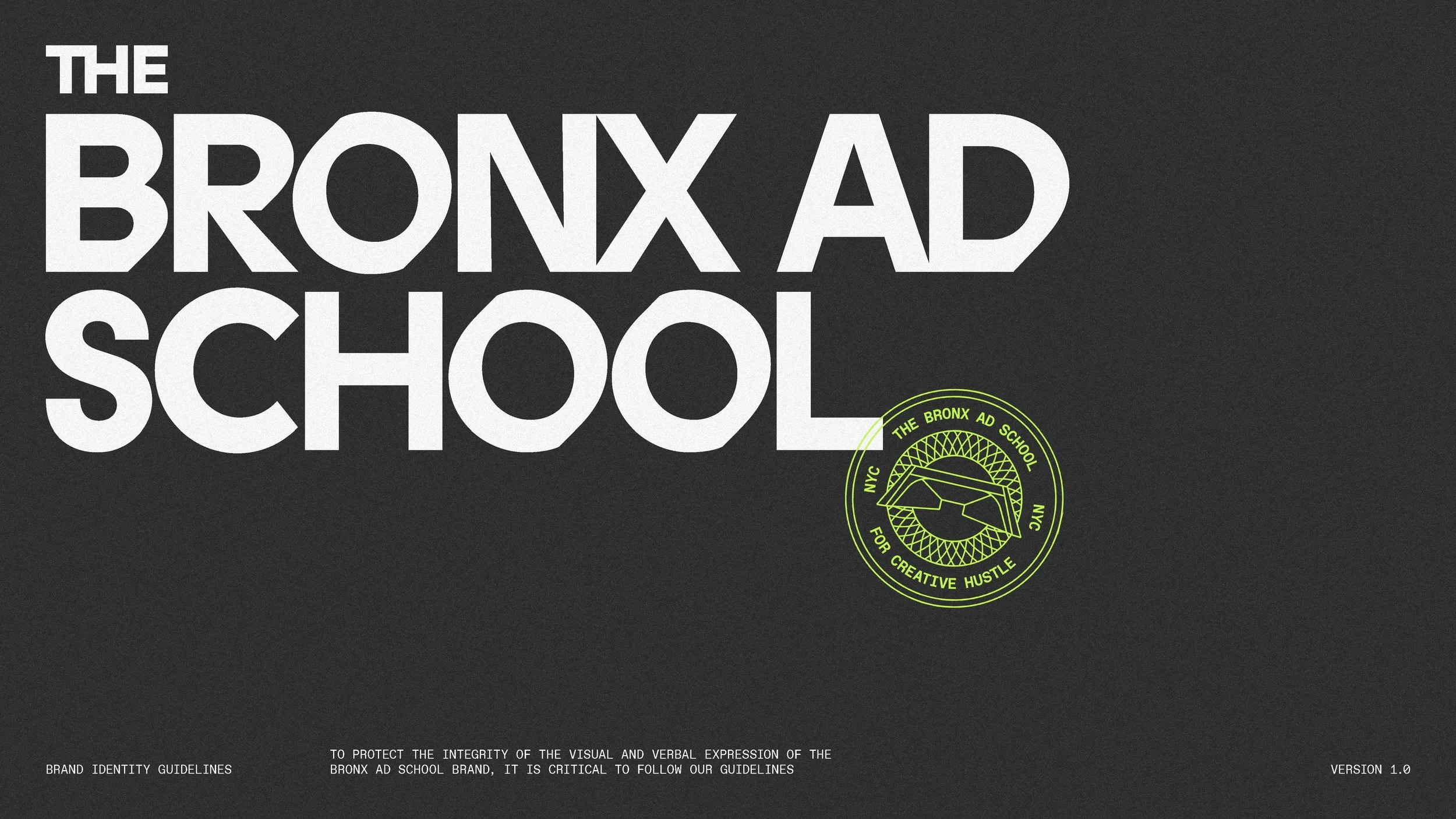
The Bronx Ad School
The B.A.D. School is committed to teaching NYC’s next generation of exceptional leaders while providing connections that will launch their careers.
Client
Advertising School
MY ROLE
AD & Brand Design

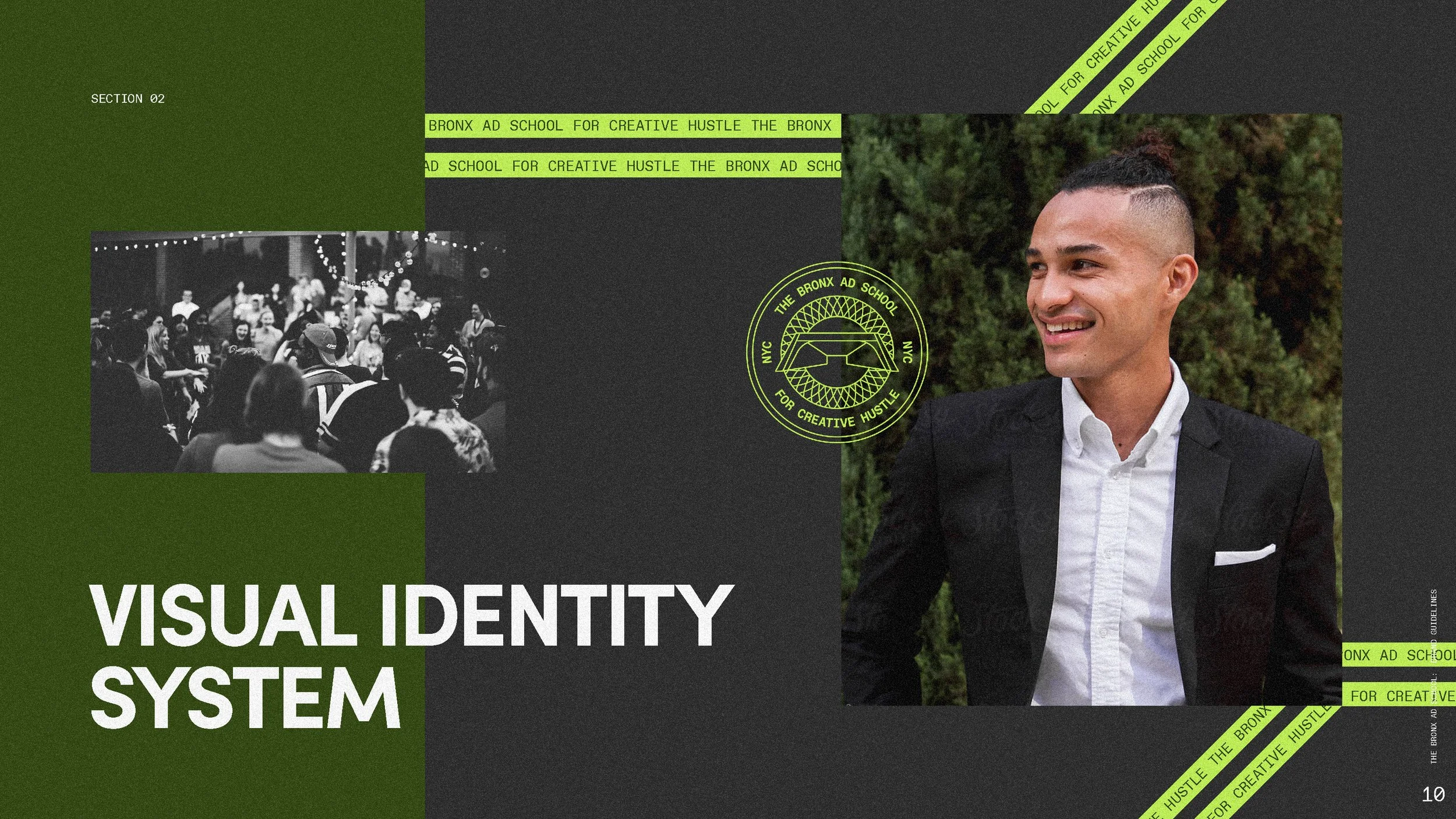
Bronx Ad School
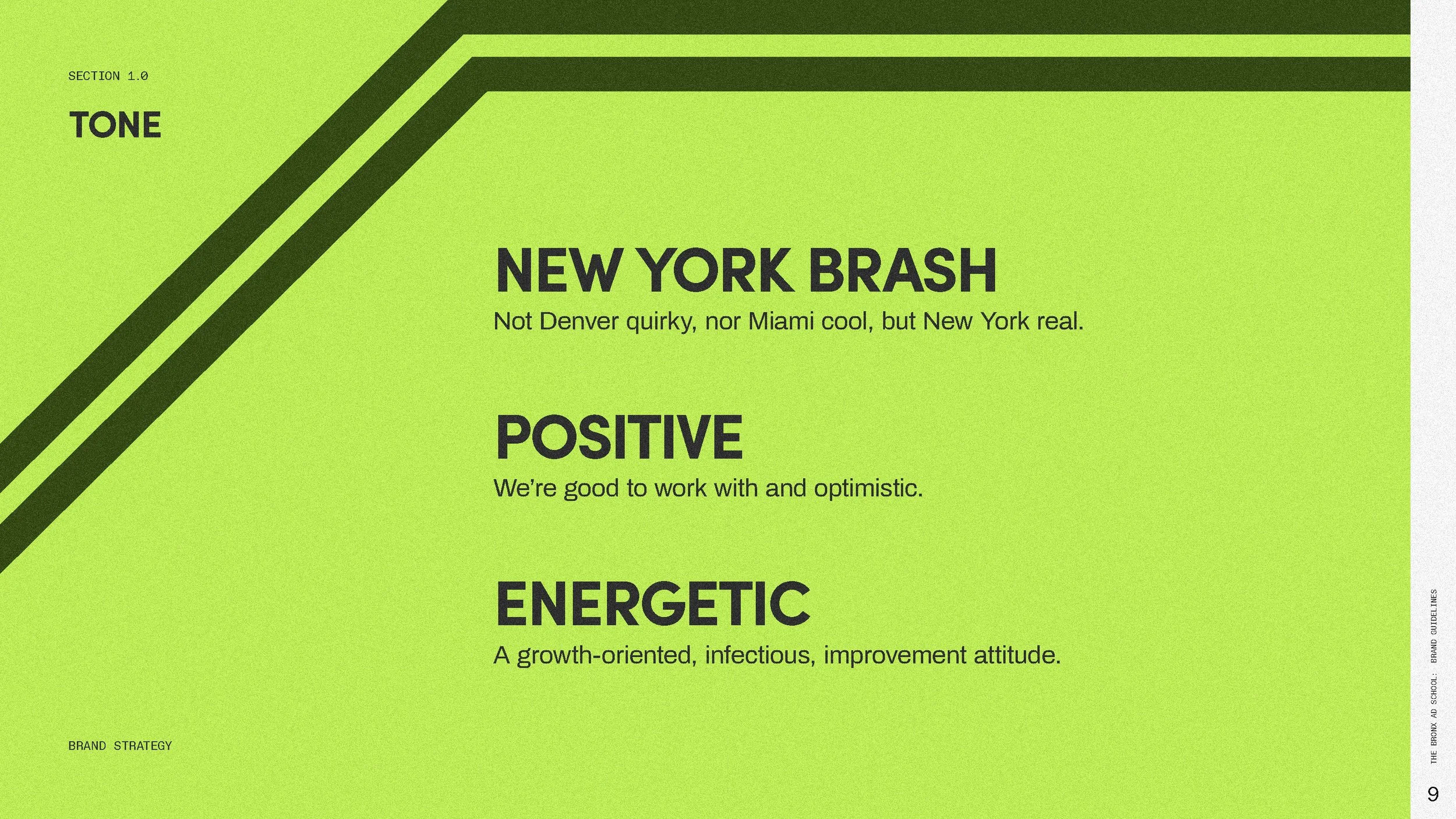
We are for the Creative Hustlers.
We are for the Creative Hustlers.
The Bronx Ad School shapes meaningful careers across Media & Marketing, Sports, and Entertainment


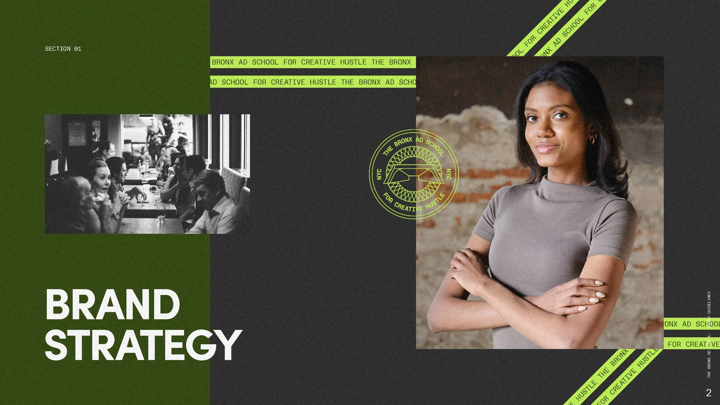
The Challenge
The media, sports, and entertainment industries face a persistent diversity problem, with many talented graduates from underrepresented backgrounds struggling to break into these competitive fields. Traditional education often fails to bridge the gap between academic theory and real-world industry demands, leaving students without the practical skills and professional connections needed to succeed. The Bronx Ad School needed a brand identity that would position them as a premium, yet accessible, alternative to traditional advertising education while appealing to NYC postgraduates who lacked industry experience. The challenge was to differentiate from competitors who focus on creative skills rather than business acumen, reflect the cultural richness and ambitious spirit of The Bronx, and attract multiple stakeholder groups including students, colleges, industry professionals, and corporate clients that could partner with the school.
The Solution
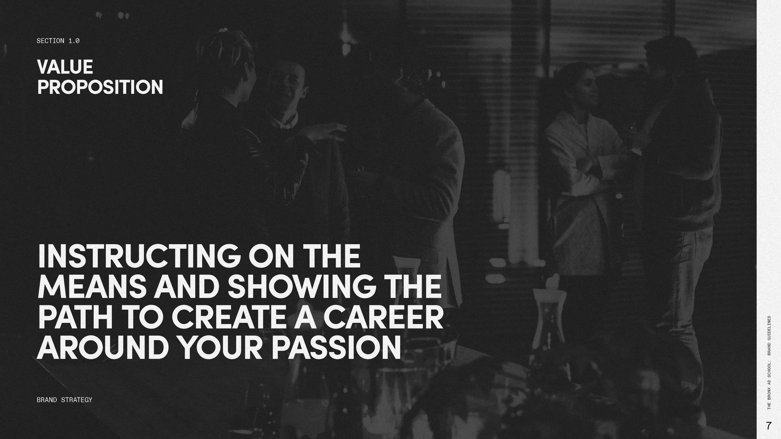
We positioned The Bronx Ad School around the idea of “Creative Hustle,” a mindset that embodies resilience, grit, ambition, and the ability to turn challenges into opportunities. The brand identity positions them as a well-connected, expert guide for students that will provide valuable networking opportunities. By celebrating the culture and spirit of The Bronx, the brand demonstrates a deep understanding of New Yorkers, helping students envision themselves as a natural part of the industry.
Unpack the design decisions that bring this vision to life in the sections that follow…
MY ROLE
Art Director at C42D
Art Direction
Brand Design
Involved with the whole project cycle, I worked closely with the strategy team during the strategy phase before fully taking over brand design and brand guidelines. I then oversaw applications of the brand as well as website design. As the voice of the brand, I'm presented all concepts and led internal critiques to refine and elevate the project.
THE TEAM
Brand Strategy Clinton Barnes, The Connected Agency
Digital Design TJ Knight, C42D


Students &
Industry Professionals
Audience
Students are ambitious young adults from diverse NYC backgrounds eager to turn their passion for media, sports, and entertainment into real-world careers. They crave practical skills, meaningful industry connections, and guidance that bridges the gap between classroom theory and professional expectations.
Industry Professionals, representing major brands, are seeking fresh ideas and inspired partnerships, and they offer valuable networking opportunities for students.
Moodboard

Providing opportunities for growth by leveraging the grit found naturally within our students.
For real hustlers.
For real grit.
For real New Yorkers.
For real.
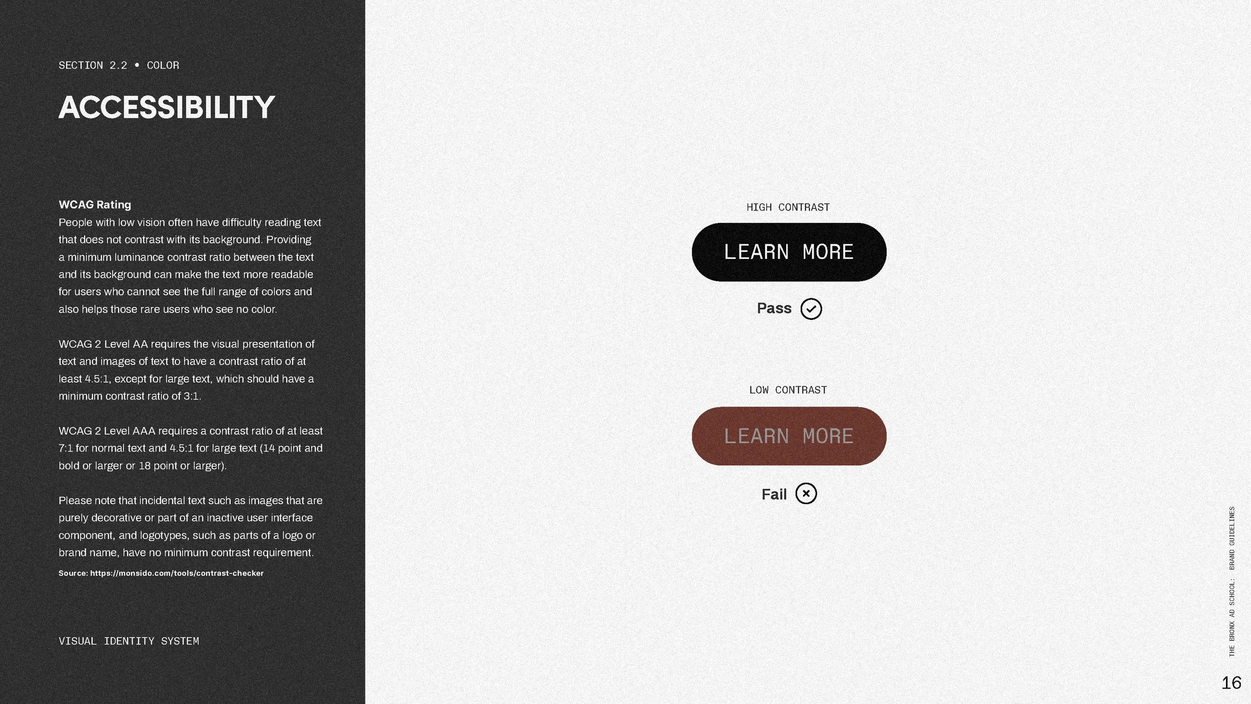
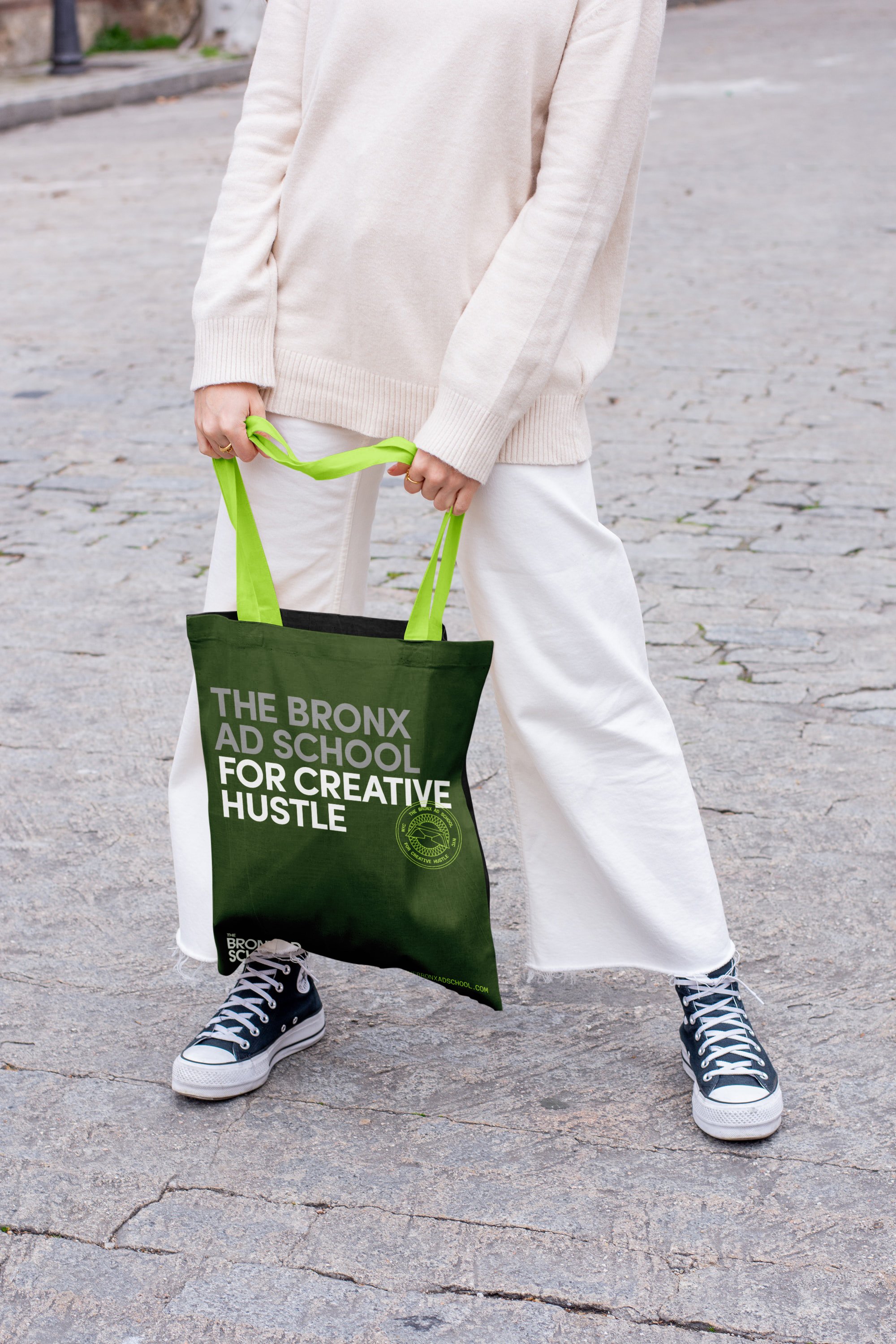
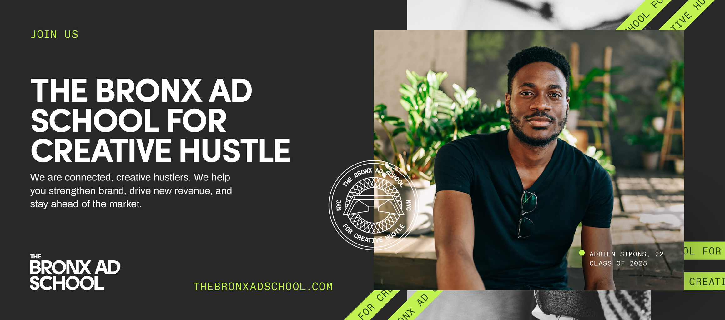
Color Palette We reflected the diversity of The Bronx, encompassing its people and environments. Dark and light neutrals symbolize a range of skin tones and urban landscapes typical of the borough: subway cars, stairs, bridges, sidewalks, concrete, brownstones, and visual grit. White is a blank slate representing opportunity, while unexpected lime green evokes the vibrancy of street art that surprises you as you round a corner. Hunter green is a nod to the green spaces locals know and love.
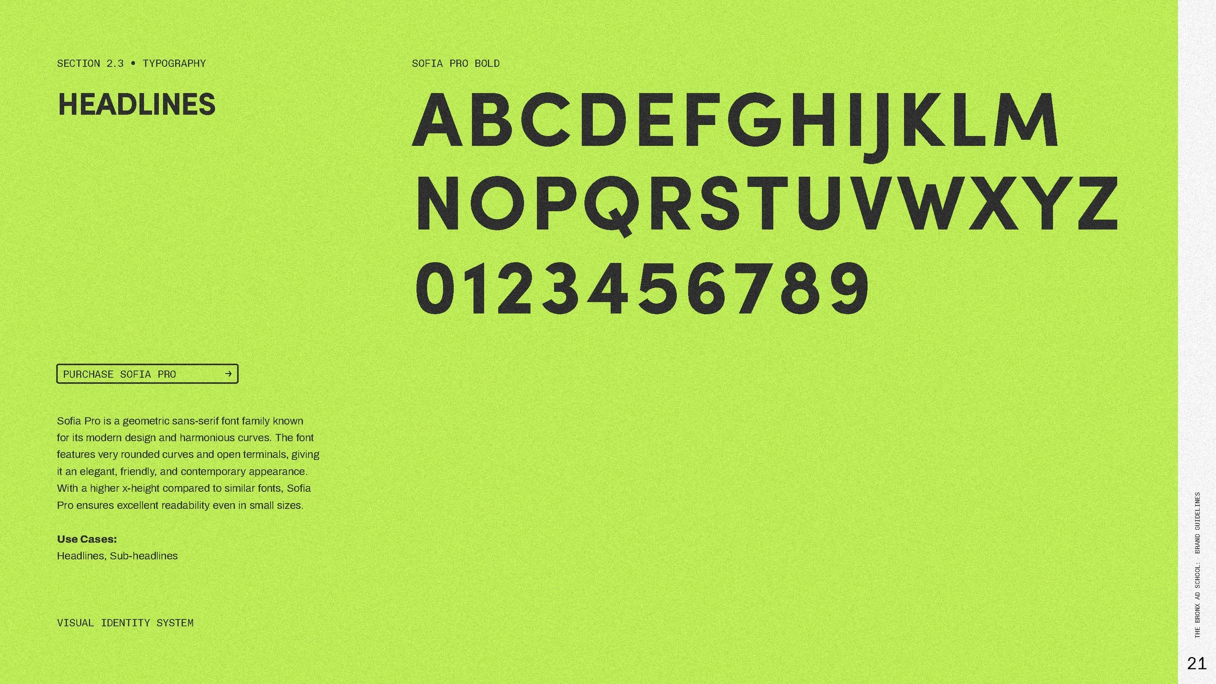
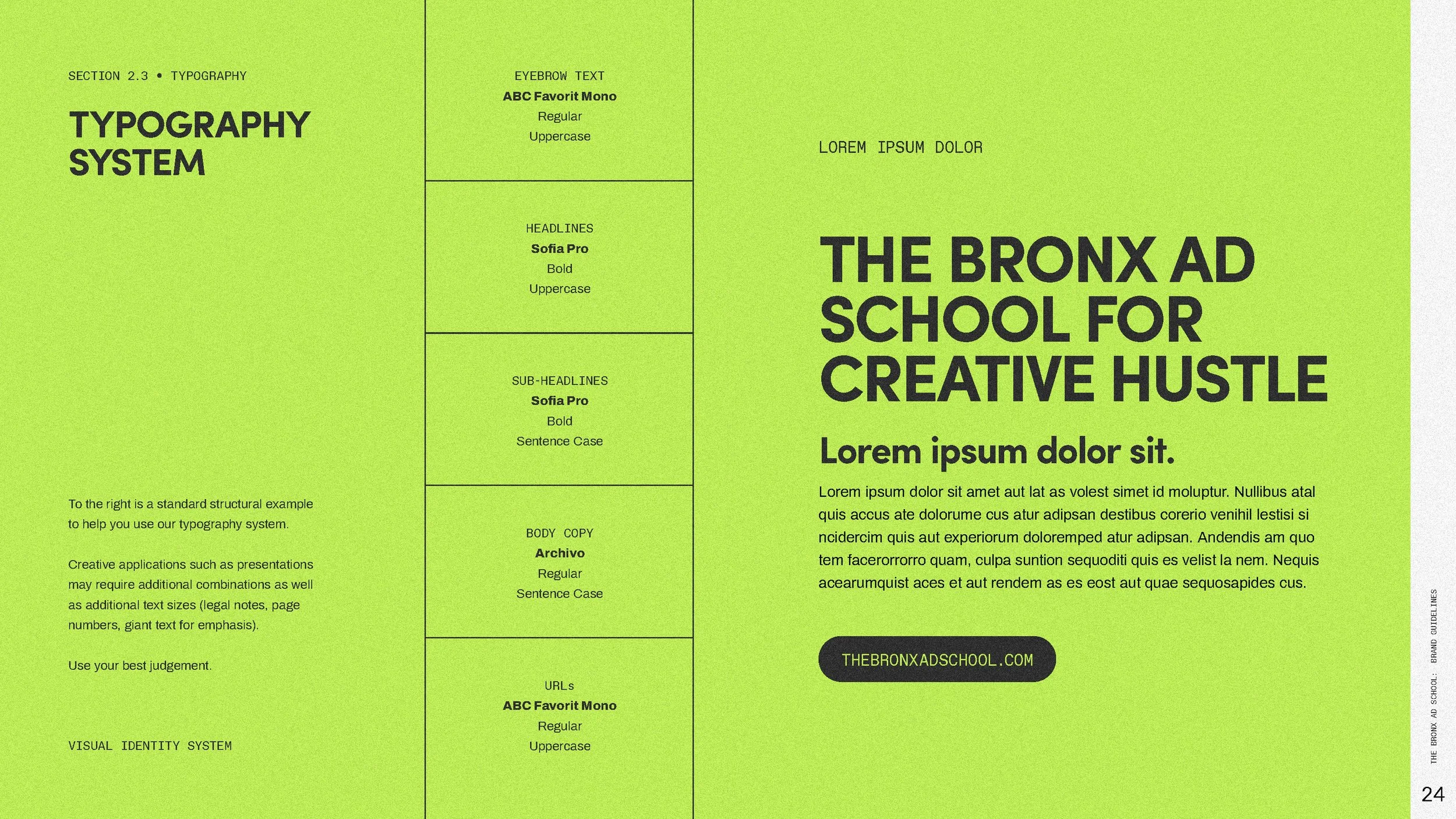
Typography Drawing inspiration from ads and entertainment posters, a bold, geometric sans typeface communicates with clarity and confidence, setting itself apart from the condensed typefaces of Miami Ad School or Bronx Museum branding. These typefaces take up space in the room. It is paired with a mono-spaced typeface which symbolizes the equitable opportunities available to every student.
Graphic Elements Bold pathways represent creative connection, serving as a network of opportunities for students to navigate, reflecting their journey from theory to practice. These imperfect lines, containing key phrases, subtly evoke street art without resorting to stereotypical representations.


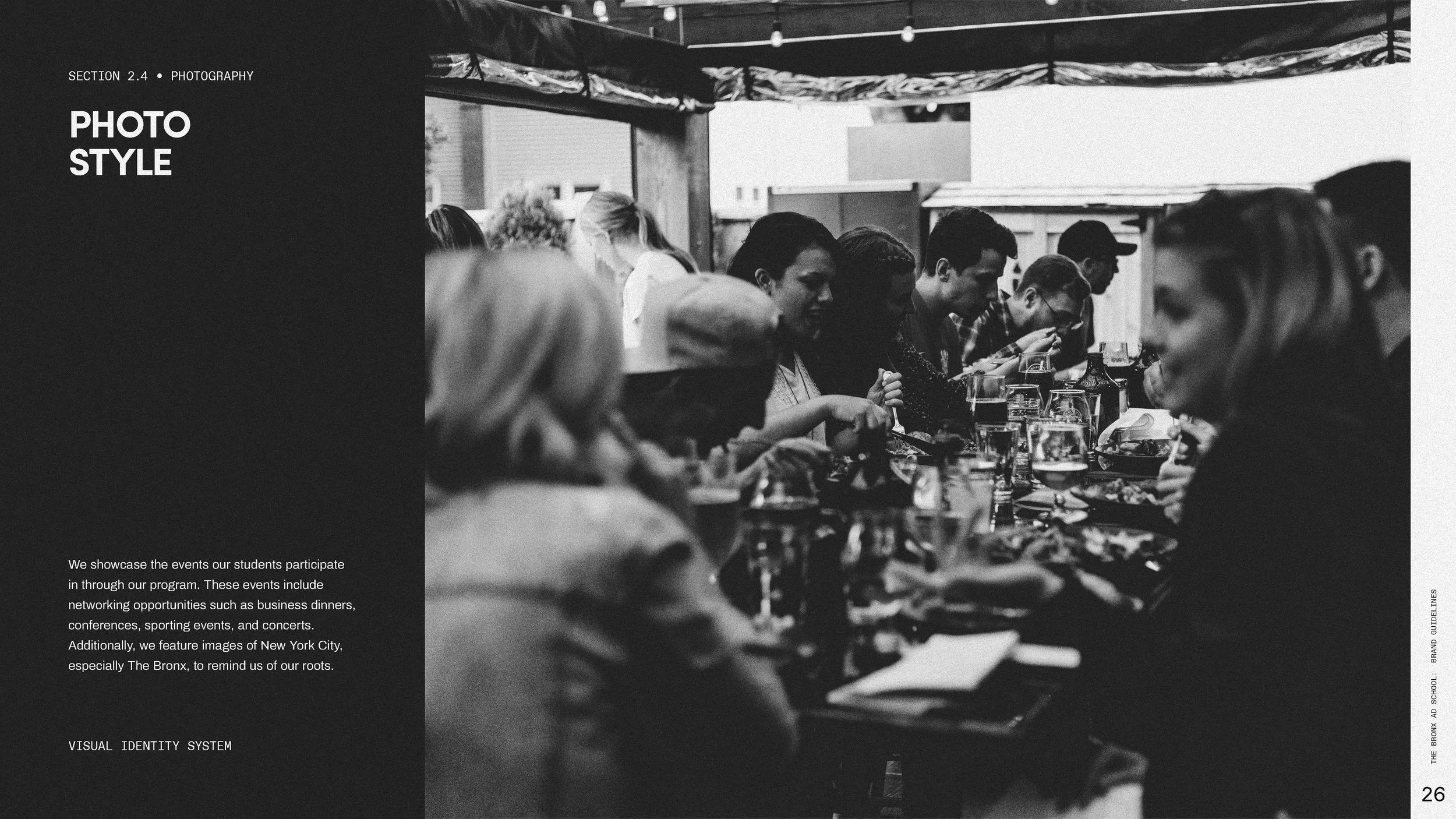
Photography
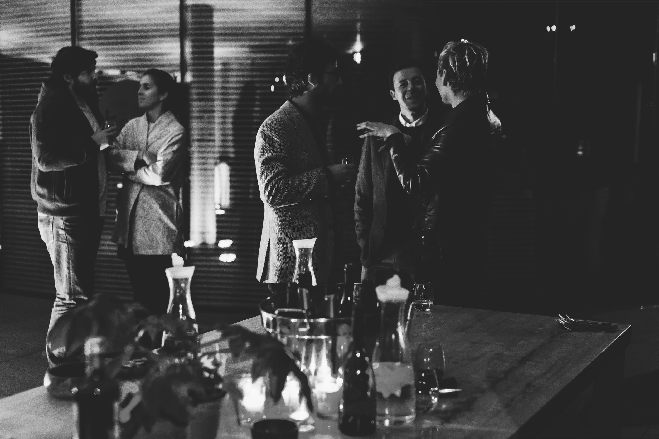
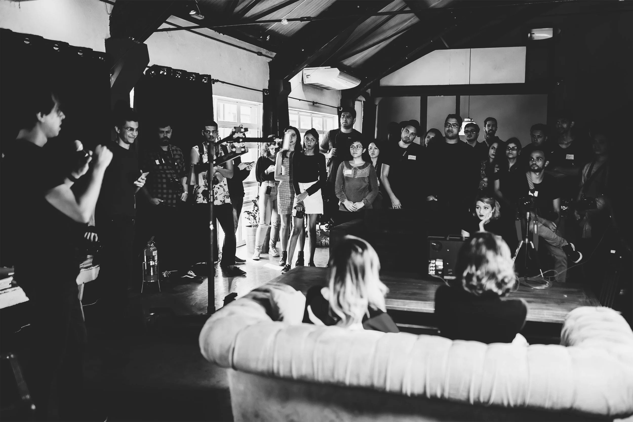
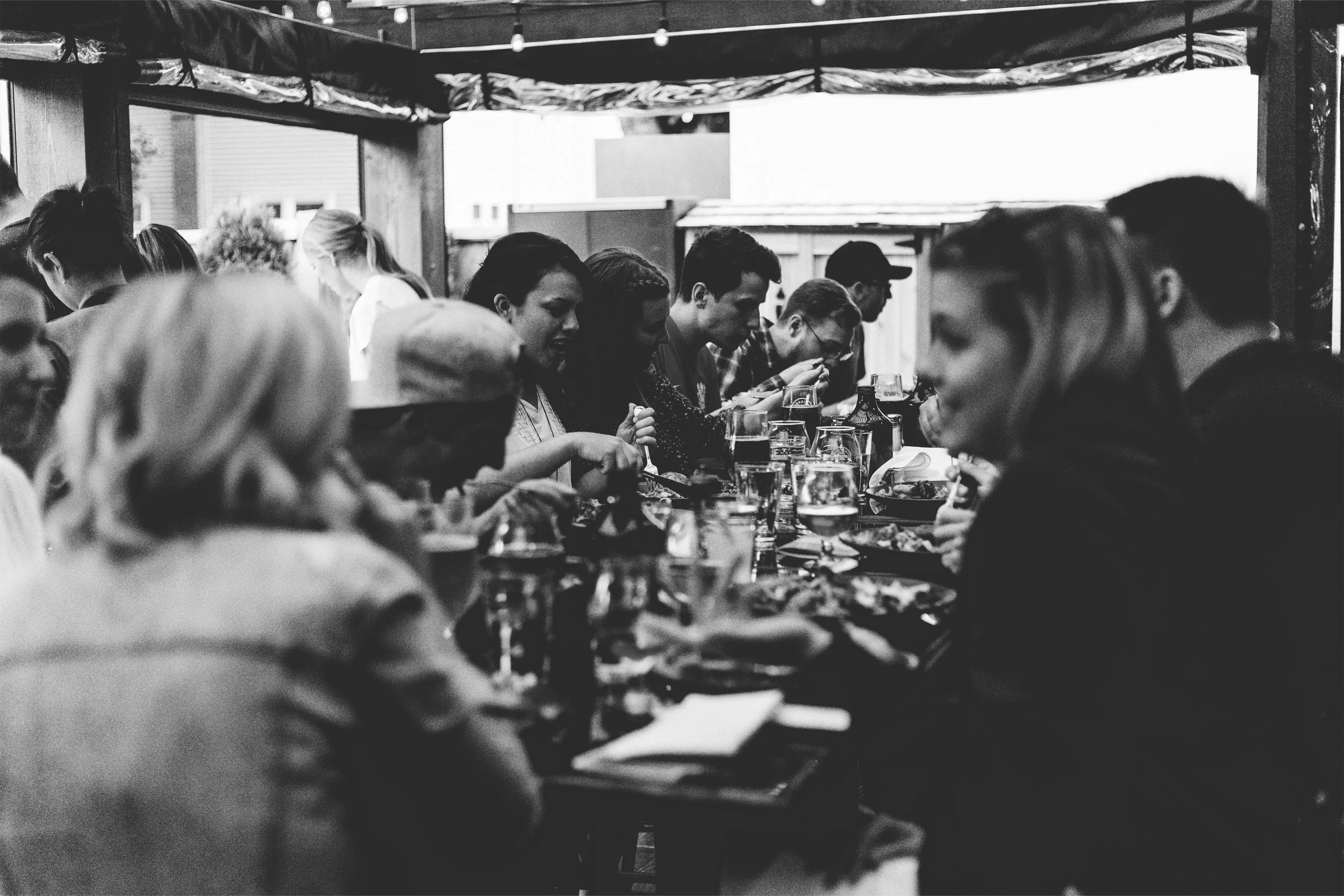
Style 01 Photography captures the student experience and the school’s connection to The Bronx. We highlighted program events ranging from networking dinners and industry conferences to sporting events and concerts, showcasing the opportunities students gain. Complementing this, imagery of New York City and The Bronx reinforces the school’s cultural roots and sense of community.
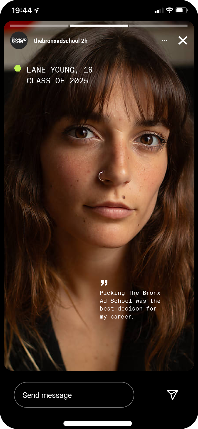
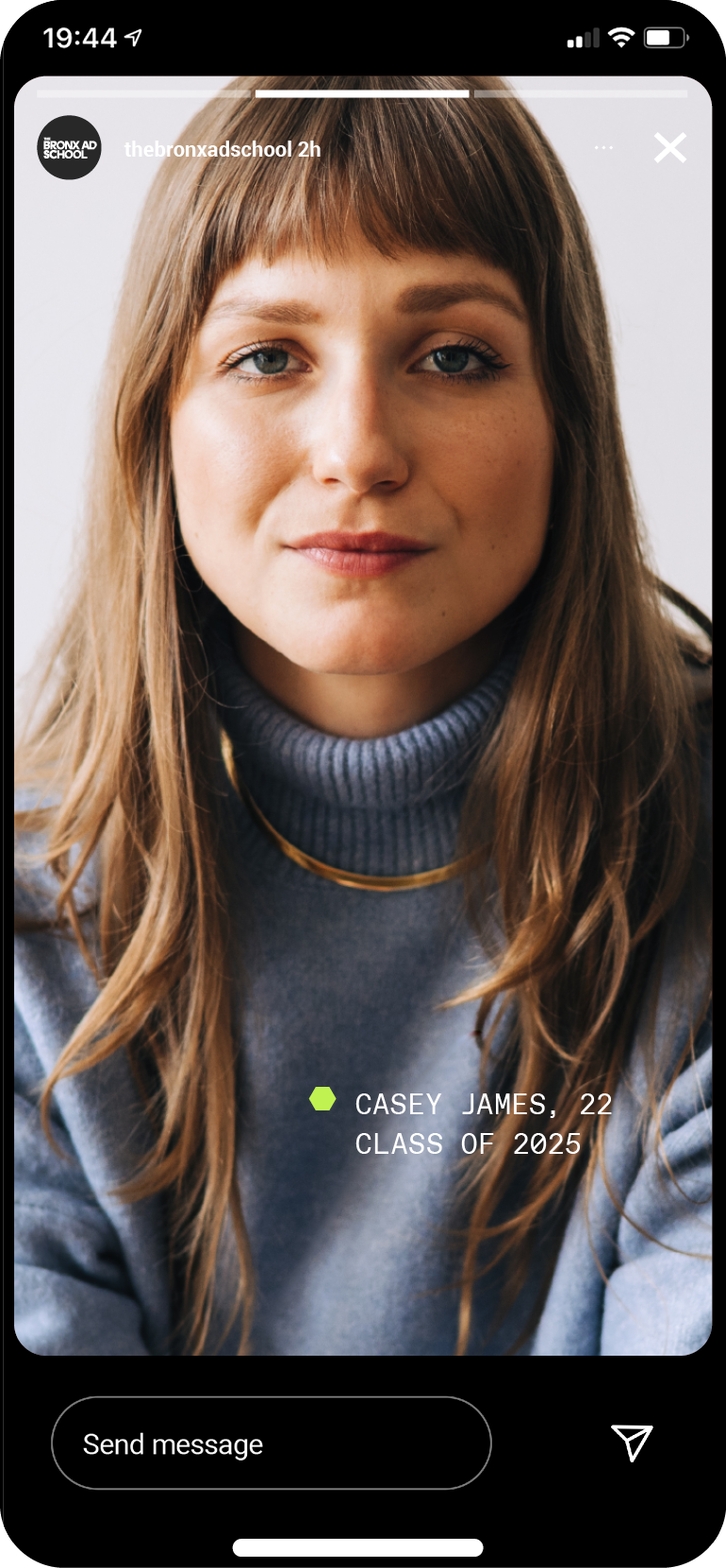
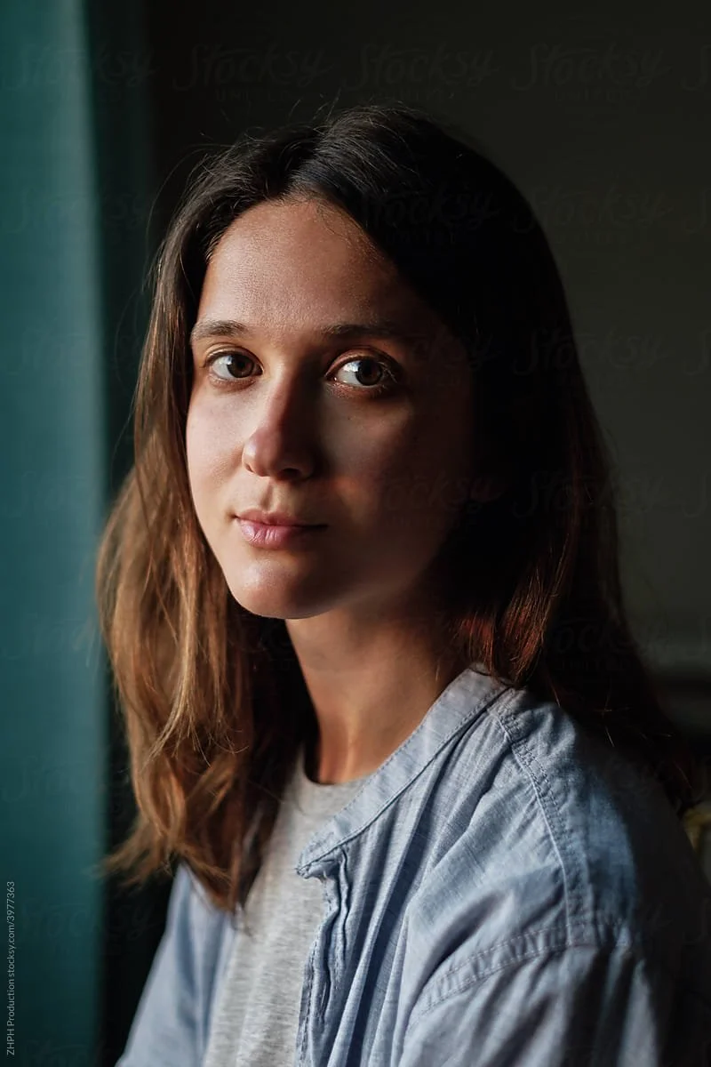
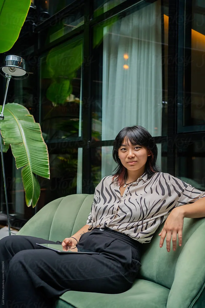
Style 02 We featured diverse personalities, cultures, and backgrounds through portraiture, capturing the perseverance inherent in B.A.D. students. Full-color imagery represents authenticity and truth in addition to the strength of each individual's character and their readiness for success in the industry.