PORTFOLIO
ABOUT
SUBSTACK

IVF is hard. Navigating it shouldn’t be.
IVF is hard. Navigating it shouldn’t be.
Alison Abate Black
Brand Design & Art Direction
Sunfish brings expert guidance—financial, administrative, and emotional—to the IVF journey.
Sunfish is helping self-pay IVF patients with transparent pricing, bundled discounts, and a partial money-back guarantee.
IVF is hard, navigating it shouldn’t be. Our goal was to bring the Sunfish mission to life in a way that feels warm and supportive. Earthy greens and optimistic accents create a sense of calm and trust while golden, sunlit imagery and gentle, nature-inspired graphics are emotionally in-tune with what people on the IVF journey are going through. The new brand reinforces Sunfish’s role as a trusted guide, bringing light to an often-challenging path. Our design strategy was the foundation for a brand experience that’s not just functional, but deeply human.
RESULTS
Sunfish re-launched in June 2025
MY ROLE
Visual Strategy & Art Direction
Brand Design
THE C42D TEAM
Brand Strategy Hema Padhu
Digital Design Sunfish Team & Tonic


Brand Guidelines
Hummingbirds symbolize resilience, joy, healing, and vitality, representing the ability to adapt.

In it with you.

Visual Strategy
This design direction strengthens the Sunfish brand by translating its mission—making fertility support more accessible and compassionate—into a visual language that feels both grounded and hopeful. The color palette plays a central role: deep and mid-tone olives convey resilience and growth, while citrus yellow and periwinkle blue introduce brightness and emotional warmth. Golden accents evoke optimism and possibility, and soft neutrals bring a sense of maturity, clarity, and transparency. Together, these hues create a calming, trustworthy atmosphere that mirrors the emotional depth of the fertility journey. Combined with sunlit imagery, nature-inspired forms, and approachable typography, the design reinforces Sunfish’s role as a reliable, empathetic partner—elevating the brand experience with care and intention.
We are in it with you.


Chosen Concept: Circle of Life
The Sunfish brand mark features two fish forming a circle, their bodies gently curled to subtly suggest the silhouettes of babies nestled in a womb. The circle they create can also be seen as the egg itself, allowing for layers of meaning within one symbol.
COLOR PALETTE
Anchored in deep and mid-tone olive, the Sunfish palette reflects growth and resilience, which are core themes during the IVF journey. Citrus yellow and periwinkle blue serve as our primary brand colors, balancing bright and fresh optimism with communicative care. Calming hydrangea blue and energetic orange act as key accents. A bright golden accent represents the sun shining on a new chapter. Neutral tones of beige, charcoal, and white provide a mature, clean foundation that symbolizes openness and transparency.


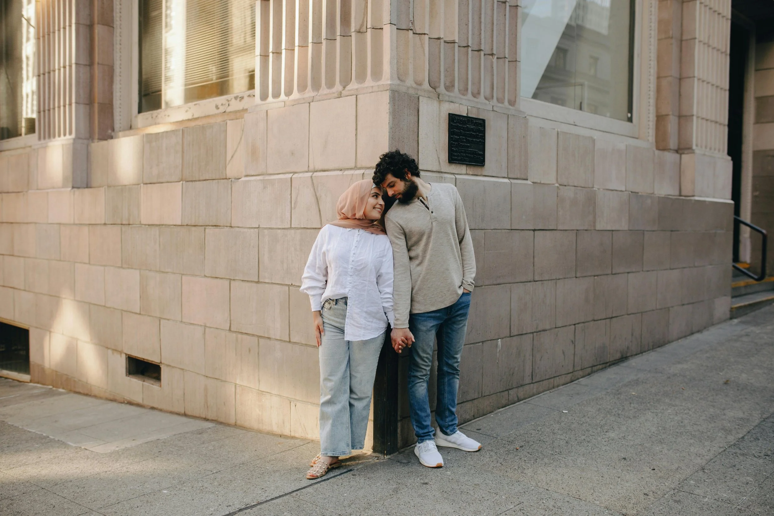


SECONDARY PHOTOGRAPHY
A secondary imagery style captures couples navigating the IVF journey. More candid and unfiltered than our sunlit photography, these images reflect the emotional depth of this challenging process by highlighting the quiet moments of research, decision-making, and action.
PHOTOGRAPHY
Sunfish captures warmth and hope through sunlit imagery. Each is bathed in soft, golden light, evoking optimism and emotional depth. Portraits of individuals reflect strength and introspection, while intimate close-ups of couples embracing convey deep connection and unwavering support. Imagery is tender, ensuring every subject’s emotions are seen and understood. This style reinforces Sunfish’s role as a trusted guide who brings light to a challenging path.